PRINT
WRITINGS
Aquel Amplex
Analogue #1: Nostalgia
The Fascists Have the Outfits
Chorus: On Intention
The Things They Bought #1
Curator Spotlight: Victoria Campa
OPERFORMANCEF Interview
On Art and Aliens
Caroline Strickland at Union Pool
Remembering Who We Are
Painting in Defense of Life
Ask Casey: A New Advice Column
Archive
COMMUNITY BOARDS
Music
Literature
ABOUT
@READCOPY.CO
WRITINGS
Aquel Amplex
Analogue #1: Nostalgia
The Fascists Have the Outfits
Chorus: On Intention
The Things They Bought #1
Curator Spotlight: Victoria Campa
OPERFORMANCEF Interview
On Art and Aliens
Caroline Strickland at Union Pool
Remembering Who We Are
Painting in Defense of Life
Ask Casey: A New Advice Column
Archive
COMMUNITY BOARDS
Music
Film
Visual Art
LiteratureABOUT
SUBMIT
DONATE
@READCOPY.CO

Food Portraits
REJECTING BEAUTY, BUT MAKE IT FOOD.
JULIE KIM TAKES US ON A JOURNEY THROUGH REPRESENTING BELOVED (AND NOT SO BEloved) morsels.
By JULIE KIM
10.6.2021
Lately, food has taken a new step up the hierarchy of human needs––surpassing its original intent, and becoming a glamorized entity to which we give away half of our paychecks and too much space in our camera rolls. Food porn, ASMR content, close-up videos of the Hit Me chocolate cake at Catch, and hell, even yelp reviews you could mistake for essays, clutter our field of vision and flood our virtual environment daily.
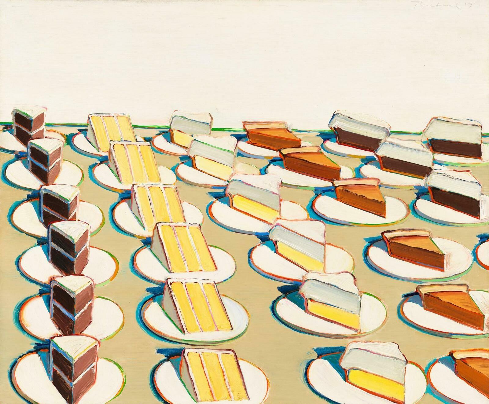
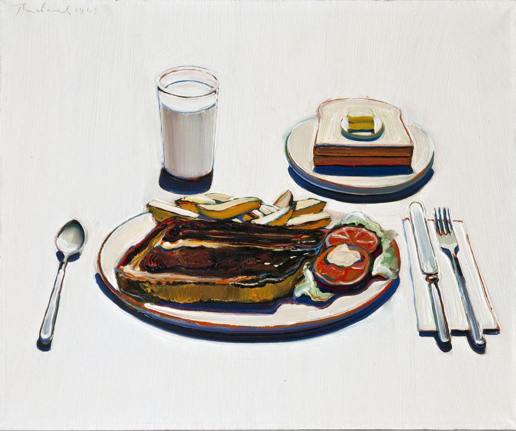
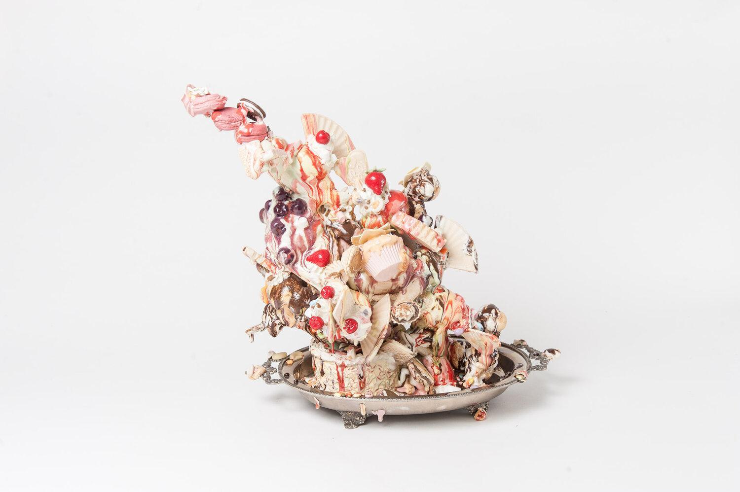
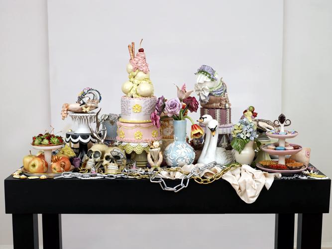
There is a myriad of art glamorizing not only the role of food in our lives, but also its appearance, as if it is a celebrity getting its’ portrait done. Decorated cakes and pastries painted in thick pastel colored oil paint by Wayne Theibaud, from the 60s. Anna Barlow and her ice cream towers, or Jessica Stoller and her porcelain feasts. Food that procures saliva but is too pretty to touch, and too fake to eat.
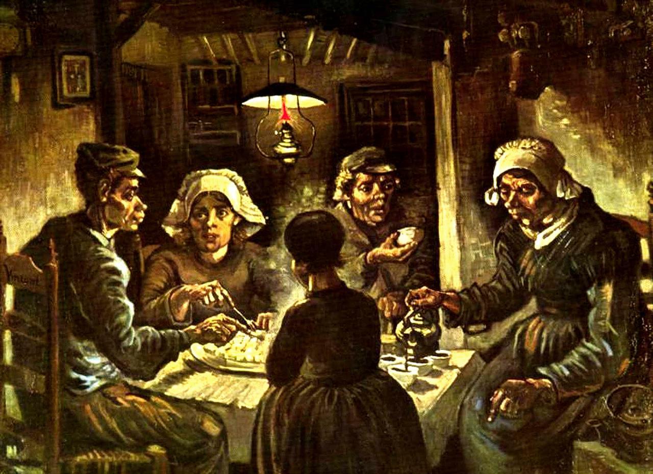
But food has been a star of fine art since Da Vinci walked the earth. Nevermind our man Leo, it goes even further back to wall art in the Egyptian pyramids. The never-ending still lives of apples and oranges from your art history class are yet another example of the popularized depiction of food in art. Even Van Gogh, Picasso, and Lichtenstein have had their share of food features, be it fruit bowls or people eating potatoes.
It makes sense. Food is a symbol of human life, existing beyond a means of survival and into the realm of celebrations and rituals. Of coming together. Of parties and festivities. Of high-brow taste, of wealth, of frivolity. Food is no longer just its physical shape, taste and smell. It’s an activity, a bonding moment, and a way to pass time. There is something about eternalizing an item that is meant to be only a momentary pleasure.
I could go on about the history of food in art history and pop culture, and all of the implications of its commoditization, but we are here today to discuss my personal take on the food portrait. So, back to the program.
THE IDEA:
I took my first college painting class my sophomore year, and the most memorable feedback I have taken away—in response to my frustrations about feeling constrained from excessively prioritizing aesthetics––was to intentionally make an "ugly painting.”
There is a myriad of art glamorizing not only the role of food in our lives, but also its appearance, as if it is a celebrity getting its’ portrait done. Decorated cakes and pastries painted in thick pastel colored oil paint by Wayne Theibaud, from the 60s. Anna Barlow and her ice cream towers, or Jessica Stoller and her porcelain feasts. Food that procures saliva but is too pretty to touch, and too fake to eat.
But food has been a star of fine art since Da Vinci walked the earth. Nevermind our man Leo, it goes even further back to wall art in the Egyptian pyramids. The never-ending still lives of apples and oranges from your art history class are yet another example of the popularized depiction of food in art. Even Van Gogh, Picasso, and Lichtenstein have had their share of food features, be it fruit bowls or people eating potatoes.
It makes sense. Food is a symbol of human life, existing beyond a means of survival and into the realm of celebrations and rituals. Of coming together. Of parties and festivities. Of high-brow taste, of wealth, of frivolity. Food is no longer just its physical shape, taste and smell. It’s an activity, a bonding moment, and a way to pass time. There is something about eternalizing an item that is meant to be only a momentary pleasure.
I could go on about the history of food in art history and pop culture, and all of the implications of its commoditization, but we are here today to discuss my personal take on the food portrait. So, back to the program.
THE IDEA:
I took my first college painting class my sophomore year, and the most memorable feedback I have taken away—in response to my frustrations about feeling constrained from excessively prioritizing aesthetics––was to intentionally make an "ugly painting.”
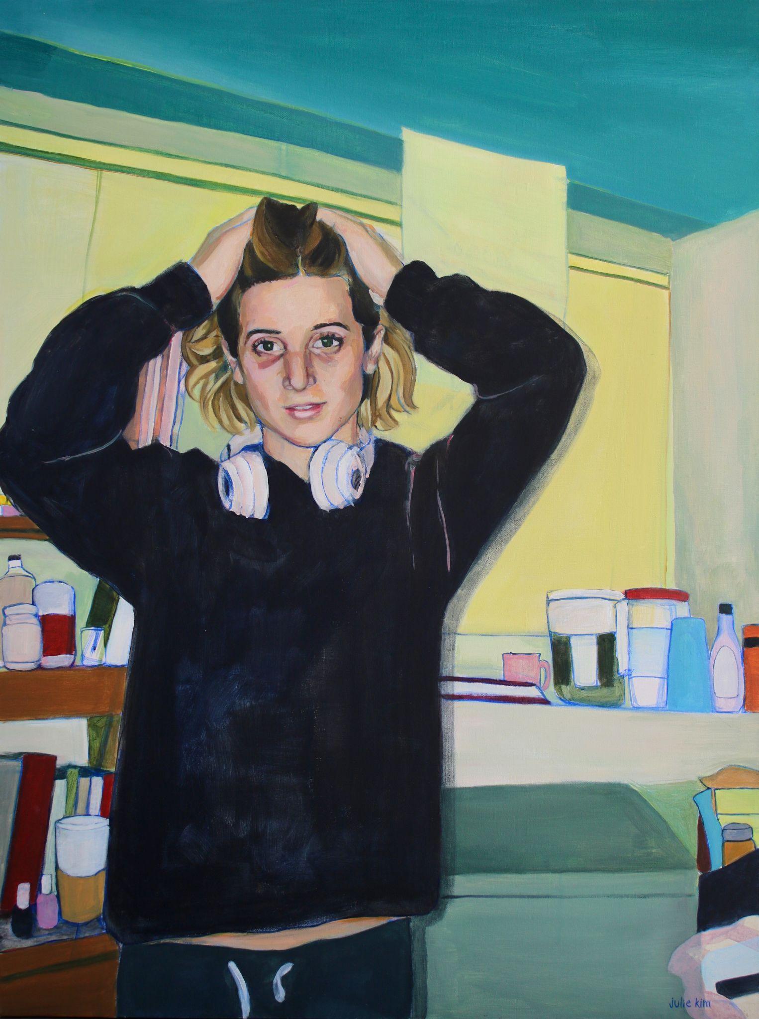
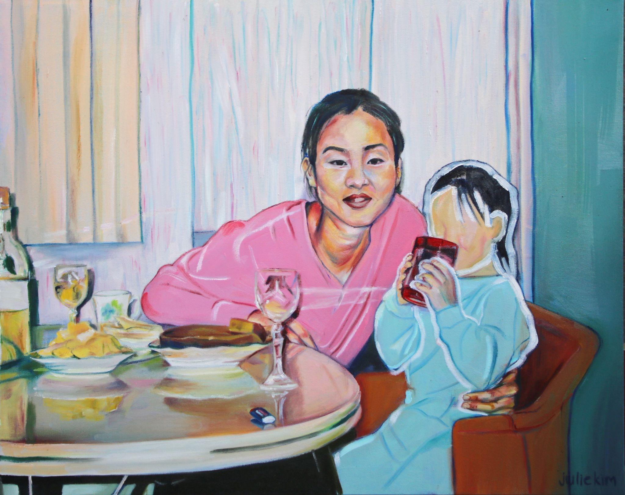
My usual style of work, shown in two older pieces
As a typical detail-oriented painter plagued by perfectionism, the words “ugly” and “painting” together sounded terrifying to me, but not terrifying enough to stop me from taking this advice. My mission of winter break 2019 was to complete a series of the most ugly work I could produce. Reveling in the concept of commoditized food, I selected mementos of various dining experiences from my camera roll––friends mid-bite during a meal, aerial shots of plates, and dining table spreads.
I intended for these to be the antithesis of the aforementioned pieces––of the “camera eats first” trend, and the glamorized dessert close-ups; thus, wholly abandoning aesthetics.
(More synchronous with the quiet, honest beat of Dike Blair’s work (but messier)):
THE PROCESS:
Since the identifying factor of my artwork seemed to be carefully curated collections of complimentary colors, I thought, what better way to shatter the aesthetic value of my paintings than to completely release my iron grip on color palettes? I started using muddled browns and greens (funny enough, green is now my new favorite color to paint with). I also employed my favorite technique: where you squint so hard to distinguish the highlights and shadows on your subject that you are seeing out of the vision you get when your super dried-out contacts are flipping inside-out right on top of your eyeballs. Despite that it may make you look like you are in a constant state of frustration or constipation, this is actually the most effective method to create some incontestable contrast and volume whilst painting or drawing. But I took it a step further, and let loose on my brush strokes too, crossing the line between painting and violently taking aggression out with a paintbrush. Going small was also the move, as the 8 x 8 canvases I chose were just enough surface area to speedily bust out some improv rendering in 15 minutes, without losing steam, and with full satisfaction.
THE FOOD REVIEW (the moment we have all been waiting for):
I present to you…
My super vague, opinionated data pulled from the shallow depths of my super patchy memory of the most random collection of restaurants (a stretch of a term, for a couple of these establishments) that are featured in my Eating Portraits series, to accompany the paintings themselves.
Given that my memory is perpetually in shambles, I make absolutely no promises on detailing how extensive the drink menu was or on giving you a paragraph on the ambience of the place, let alone a reliable two-sentence review on the single dish that I ordered.
I. Jack’s Wife Freda, West Village, NY
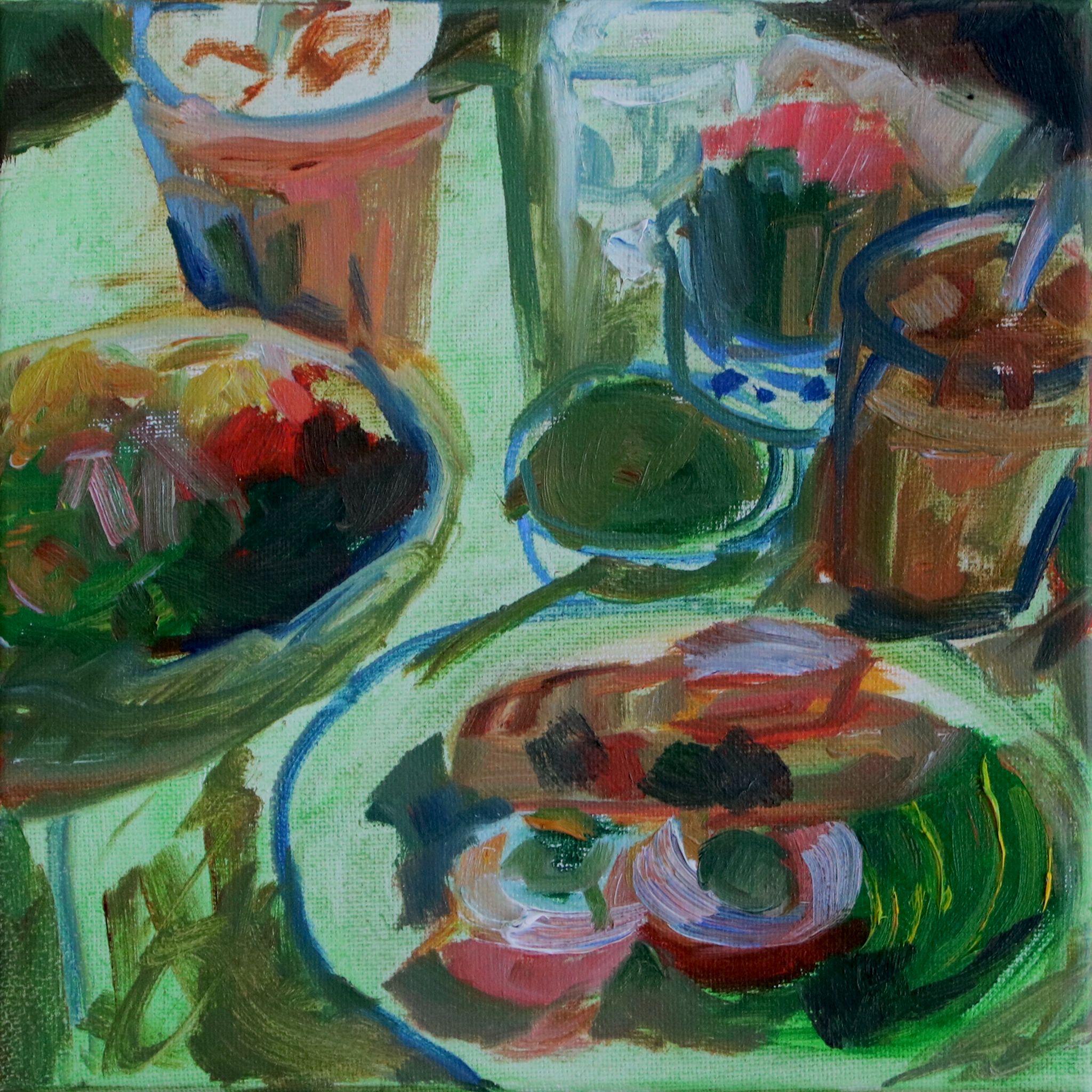
Of course I had to pay tribute to the ring leader of trendy brunch spots from 2018. As the debut piece of the series, this painting was inevitably also the guinea pig to test the waters with reckless brush strokes, unappetizing colors, and leaving spaces unkempt. I drew upon the sensation of sketching with a pencil. The objects are less fleshed out. The table is quite literally a singular turp wash layer. Our eggs and lattes are barely identifiable. My sole objective was to paint the shapes that I saw without a second chance to beautify them. As for the dining experience: A very filling brunch, satisfying Eggs Benedict, crowded, small interior with lighting that made it somewhat difficult to feel cozy and settled. Never thought about it again until now.
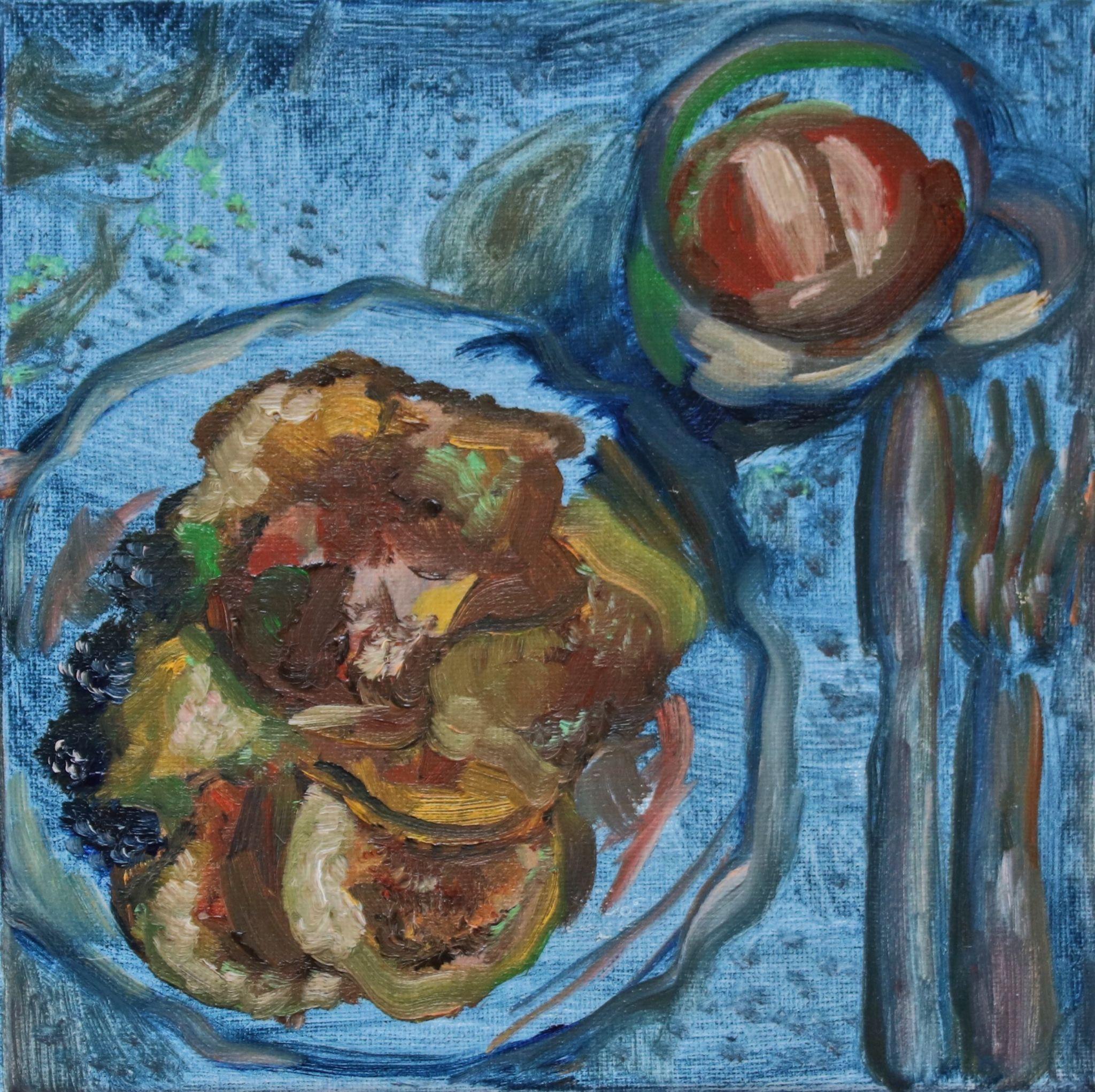
This is probably my ugliest panting in the series, but also in a different sense, my least successful piece. The entire painting exists on the same plane, with only the heavier rendering of pancakes and iced coffee set atop. I went for shallow and grim, while later, I learn to be both quick and full bodied. This is a homemade pancake breakfast by yours truly, set on my dining table at home. The topping of the day was blackberries. I have an iced coffee in a mug to accompany my stack. Text me for my recipe. 10/10. 5 Michelin stars.
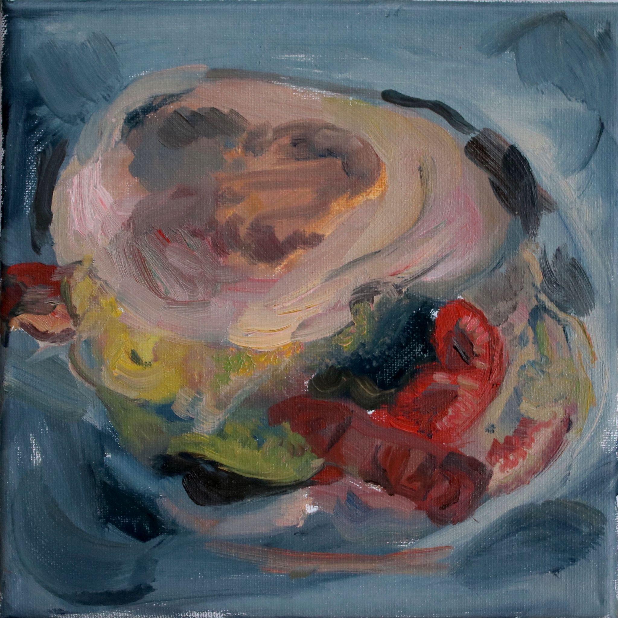
III. Love Meat, Korea Town, Los Angeles.
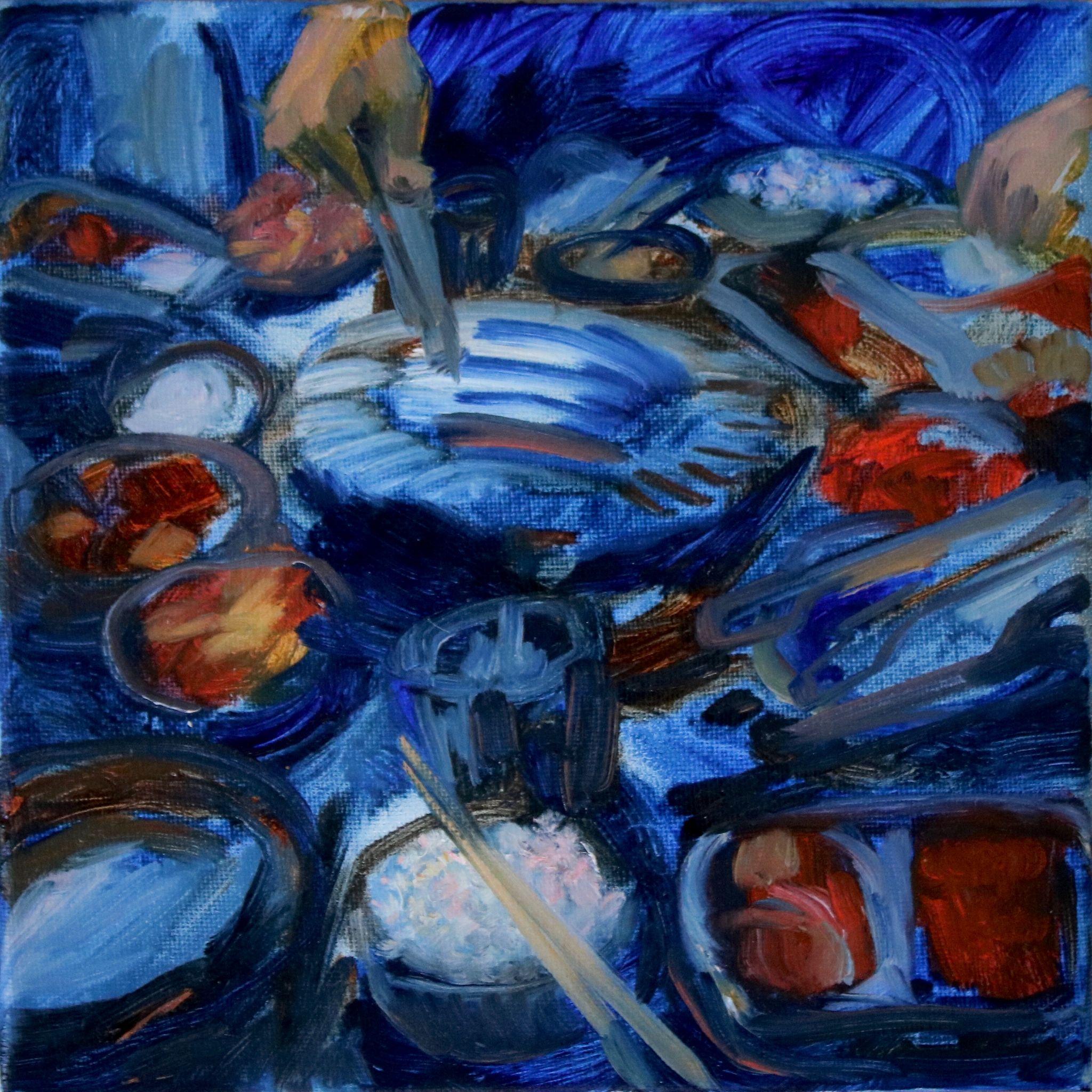
Most of my experience during this classic Korean BBQ experience in the heart of LA’s K-town consisted of yelling at Micaela, with her hometown friend, a fellow Korean, about how much rice she was eating and therefore not leaving enough stomach room for the actual all-you-can-eat meat. Such a Korean thing to get pissed at someone over. The complimentary banchan (side dishes) were pretty phenomenal in variety, and the meat, especially the chadolbaegi (thin slices of brisket) and the marinated ribs, was spot-on. The interior reminded me of the traditional pocha tents in Korea, plastic stool and all.
I decided to go full ultramarine for this piece. Here, I’m still in the stages of figuring out the most efficient way to establish presence with the least amount of brushstrokes possible. The kimchi, rice, and chopsticks are there, but all of the metal bowls and utensils get lost in the shallow blue surface.
IV. Random cookie store, Soho, NY:
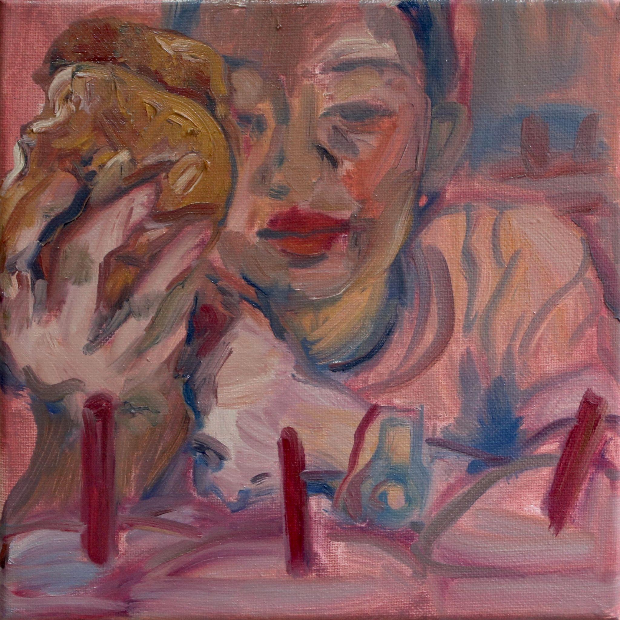
Picture this: Fellow COPY writer Kate and I clutching our jackets through the February wind tunnels of the city, on our merry way back from The Blond at two in the morning. We stumble upon an open establishment. The name is unknown, but we are certain of its proximity to Howard St, and its status as a late night savior. We walk in, Kate orders a cookie, and eats it. For some reason I mistake it as a bagel. Maybe because it was the size of her face. I snap a picture. No clue what it tasted like, since I didn’t take a bite. And if I did take a bite, I have no recollection to back up any review I would write for it. Points for size though.
I have two words, nine letters. (Say it, and I’m yours. Ha ha): Pita. Bread. Unlike any other of its kind that I have encountered in my 21 years of living. The crunchy exterior and dreamy, fluffy innards that were so soft they were heaven-sent, come together to form a rectangular loaf, sized to fit perfectly in your palm and swallow in one go (not really). But excellent for ripping apart and dipping in the assortment of Mediterranean dips we ordered, which were also delicious, but not nearly as unforgettable as this miraculous hunk of gluten that you could’ve mistaken for a piece of Focaccia. But don’t be fooled, on the inside is the most supreme version of pita you will ever taste on this earth. Latte was also great! It was really enjoyable to paint every element with uniform brushstroke widths. In this one, I sometimes carried lumps of paint straight over on my brush without mixing on a palette, and laid them on thick, like cadmium red I used for the Shakshuka, sauce, and Kate’s lips.
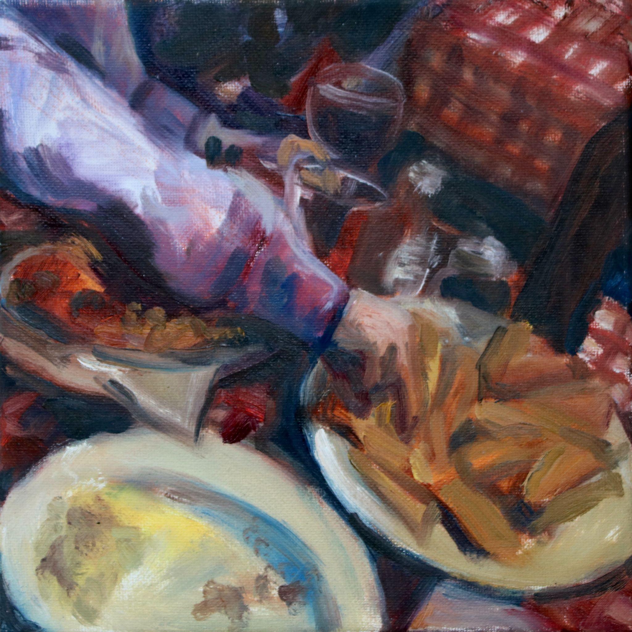
VI. Maison Pickle, Upper West Side, NY:
Maison is the ultimate NYC dining experience. Waiters dressed in white button downs and black aprons, a full bar at the front and back, an open kitchen, and mezzanine floors of tables, all topped with an entire wall made of mirror. Contrary to the ultimate NYC dining experience, however, are their massive portions. One order of chicken and French toast - a literal tower toppling over on your plate - could last you 3 days. I recommend the Razzle Dazzle (pictured in painting) for drinks, any of the pull-apart breads (doused in butter and rainbows) for sharing, and their classic French Dip sandwich or as the main. For dessert, the creme brûlée is spectacularly crunchy and melt-in-your-mouth creamy, but their famous 24 layer cake is a must. Thinking about the class of Maison must have made me stray from my ugly color streak and trade in some brights and pastels instead. Half-hearted cocktail glass rendering can turn out to be pleasantly charming.
Now that I live walking distance to this place, I’ll be trying everything on the menu. Ideal for taking leftovers home.
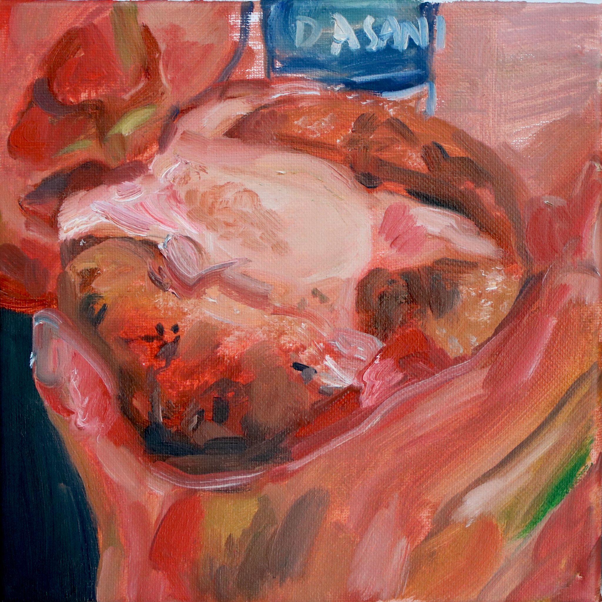
VII. Burger Shop (The Counter??) at LAX, Terminal 7:
I will give out free burgers from a burger joint of choice to anyone who can answer to how and why this atrocity of crumbly bacon and patty slapped between two stale English muffins was $12? Obviously, I still ate it. What was I to do, starve on my 6 hour refreshment-less plane ride back home? I saw this place my most recent time in LAX a couple months ago, too. But trying it once was already one too many times. Hopefully, the grey palette is enough to communicate how I felt about this one. I entertained it for a moment but then thought about my tribute to the bleak and barrenness of it all in my painting, and then swerved around to opt for a $14 newsstand chicken wrap instead. Bet you can’t guess which one was the worse bang for your buck.

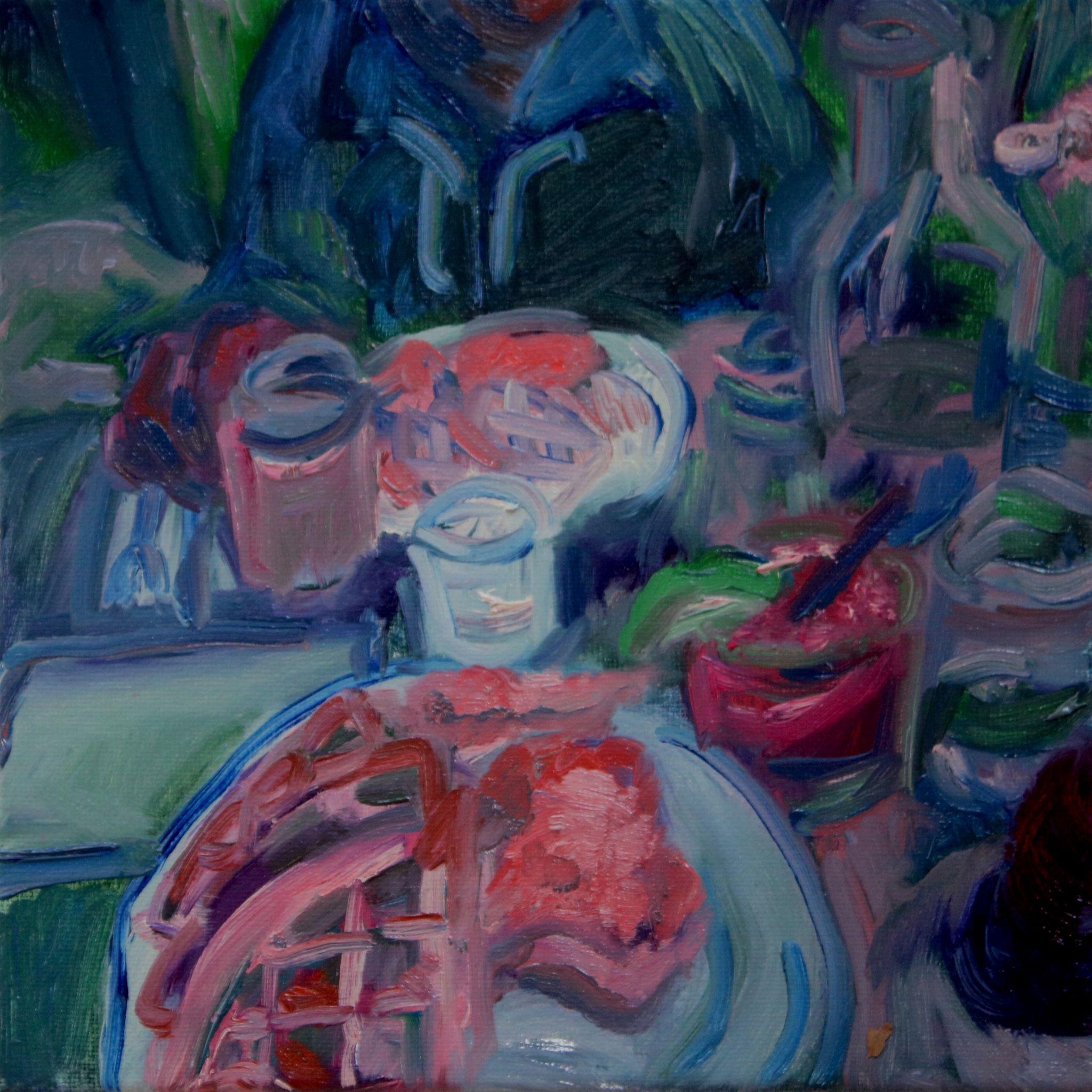
My dark umber and ultramarine mix for black takes foundation in this rendition of a Valentine’s Day dinner with a group of friends. I added in warmth with different variations of quinacridone red dispersed throughout the dinnerware and flesh, which captures the cozy glow I felt throughout dinner. With a more minimal palette, I have a clear grasp on highlights and shadows, which makes reflections more lifelike even without realism. This was a traditional American spot with rustic decor, hanging picture frames, and a reliable menu full of classic entrees and sides (fries!). A bit too dim for first dates, but ideal for chatting in small groups.
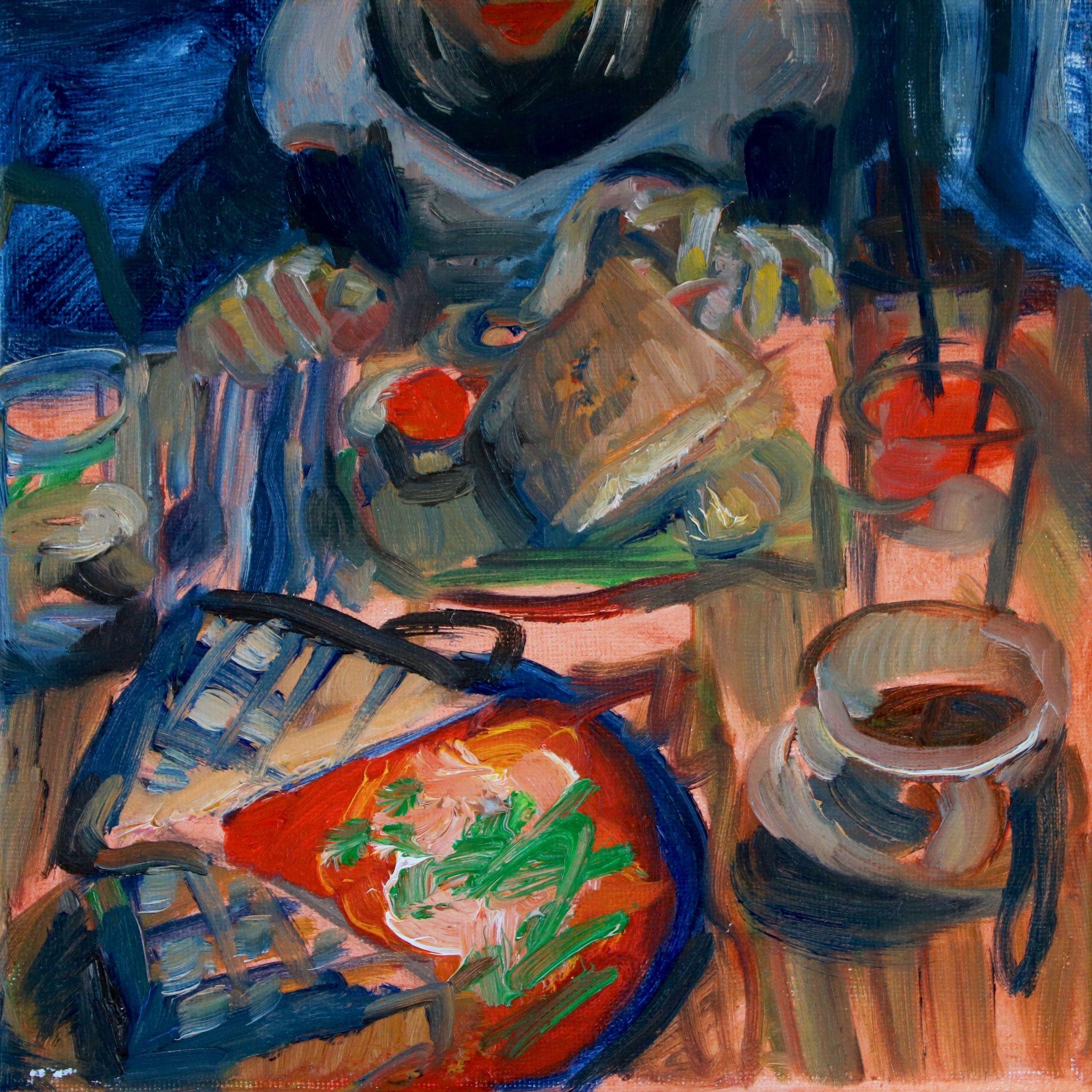
VIV. Sweet Chick, Lower East Side, NY:
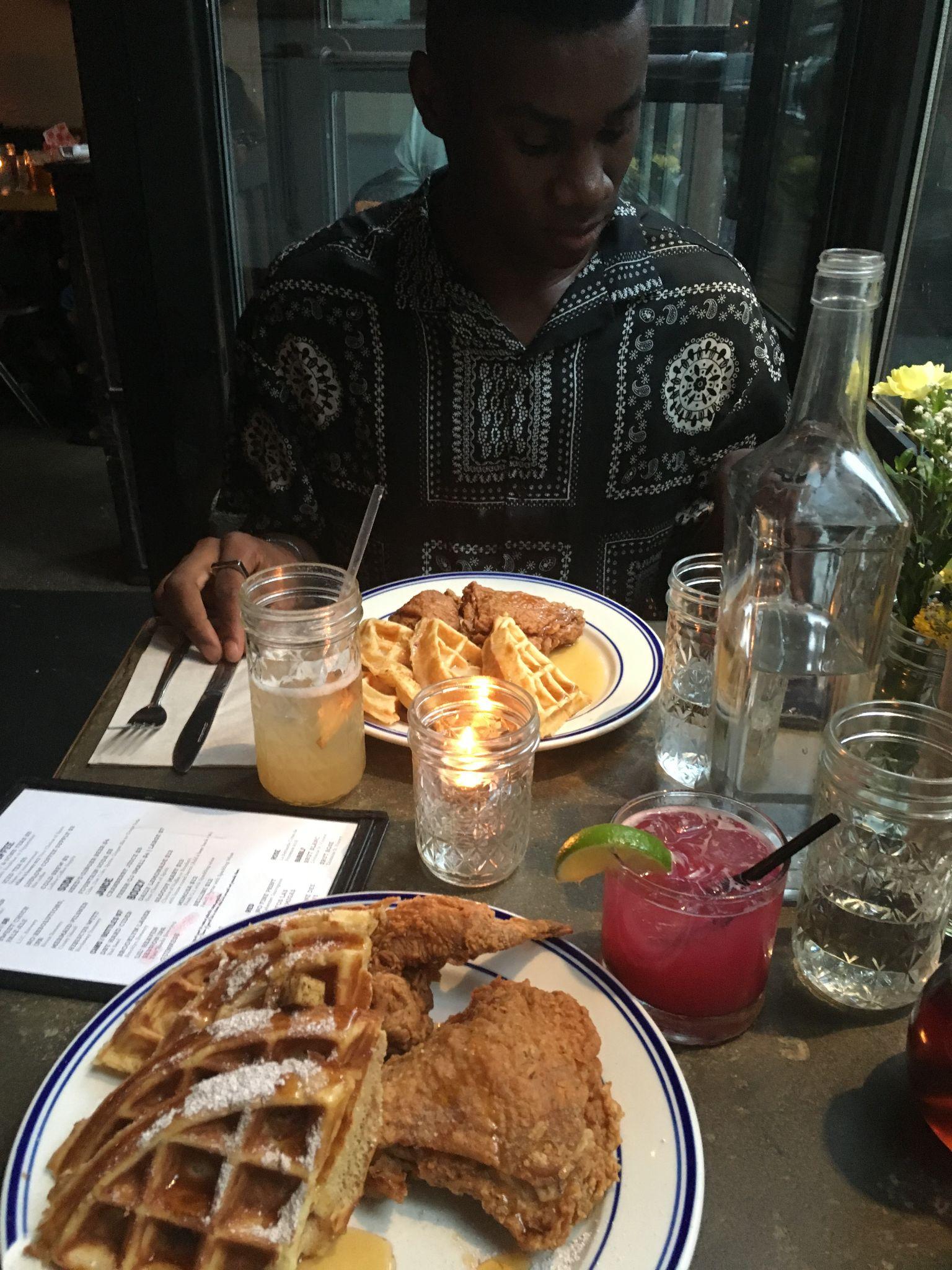
I’m surprised that I haven’t gone back to this place again, as my one and only time there made my top 5 most satisfying dining experiences. It’s an LES-ified chicken and waffles restaurant, with creative cocktails and beautiful table set-ups. It was probably the best chicken and waffles I’ve had, although I certainly am not qualified to be the judge of that. Each dish involves a flavor twist on the classic Southern staple, whether it’s apple cinnamon waffles or chicken with an extra spice kick. My friend Ty and I raved about how the waffles were just crispy enough on the outside and fluffy on the inside, and how the fried chicken batter made us levitate. The perfect amount of pieces and flavoring, too, to hit that sweet spot but not go overboard on your digestive tract.
Here, the clutter of careless, rushed strokes on the table somehow congregate into something serene. There is a pleasurable rawness that comes with lathering on thick paint with a loaded round tip brush, that can make you feel both like a heathen and a sophisticated artist at the same time.

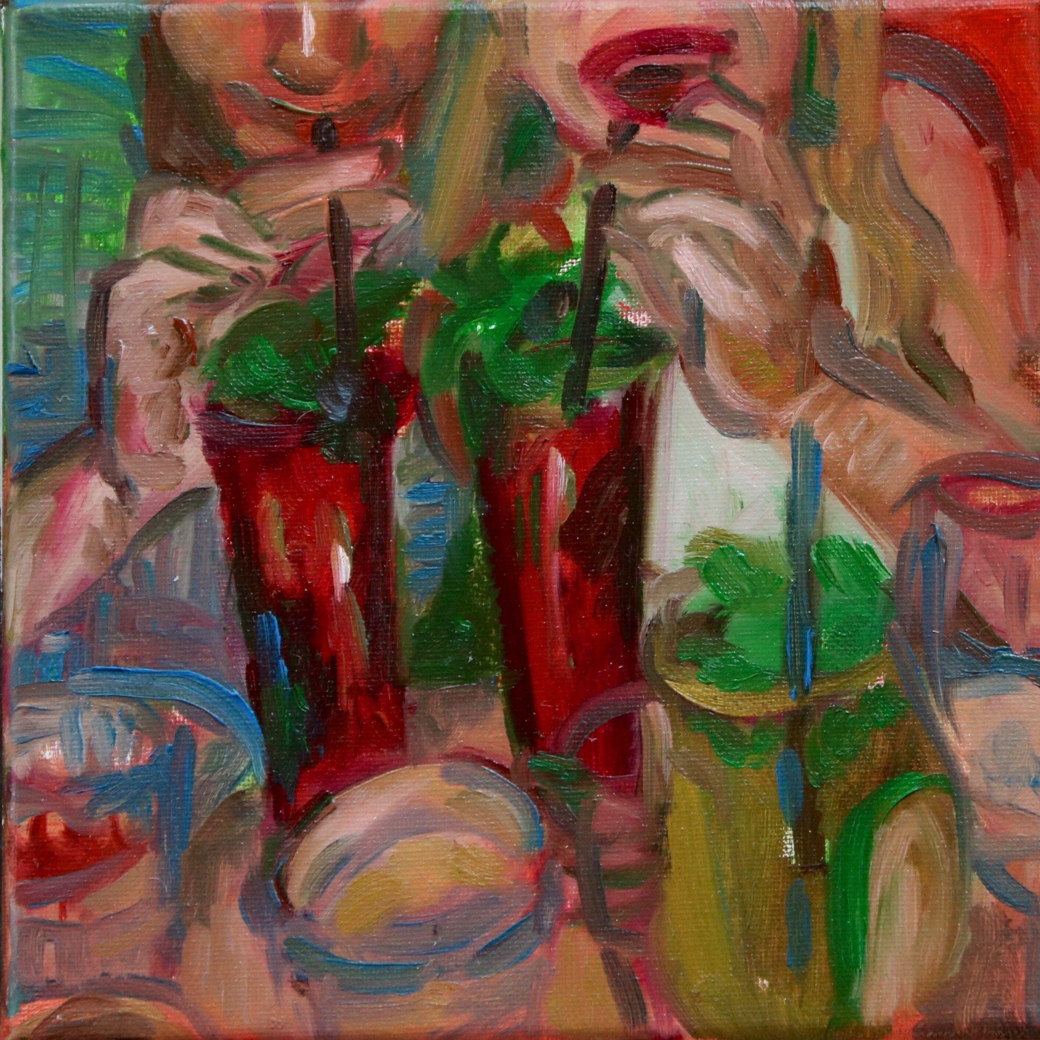
This dinner was a blur, to be completely transparent. I remember the peanut sauce that came with our summer rolls, and how undeniably they satisfied my cravings. No memories of the pho remain in my brain, which unfortunately means that it was not stellar. It was a great date night atmosphere, with the dimness setting being just dark enough but still with ample light to actually read the menu and see what you’re picking up with your chopsticks without shining your iPhone flashlight. There are definitely more memorable places for pho.
The unintentional and hasty color combinations here are probably one of my favorites in the series––the muted cool greys drizzled over a thinner layer of bright orange, balanced with variations of ultramarine mixes. Just the right amount of saturated tones coupled with greyed out shades from all around the color wheel.
XI. Wendy’s on 8th Ave:
A sub-par Wendy’s location. Maybe it was the plain chicken sandwich I got with my 4 for $4 or the un-appetizingly bleak Columbus Circle neighborhood we were looking out at, but I’ve had other Wendy’s experiences that hit the spot a lot better than this one. At least they got my order right! If you’re like Micaela and I and need your weekly fixing of Wendy’s, there aren’t a lot of locations to choose from in the city, so you’ll probably end up here. I’m just gonna take this opportunity to unload my Manhattan fast food complaints, especially my Taco Bell experiences. The Baja Freeze machines at any and all locations are NEVER working. Just go to Wendy’s. Towards the end of my journey, I abandoned the dark background streak for a moment. I mindlessly blended the pinks and blues, but made sure to distinguish the yellow ochre burger bun with extra heavy coatings. As the angry painting faded out, I think I took on a rather Van Gogh esque style of brushstroke.
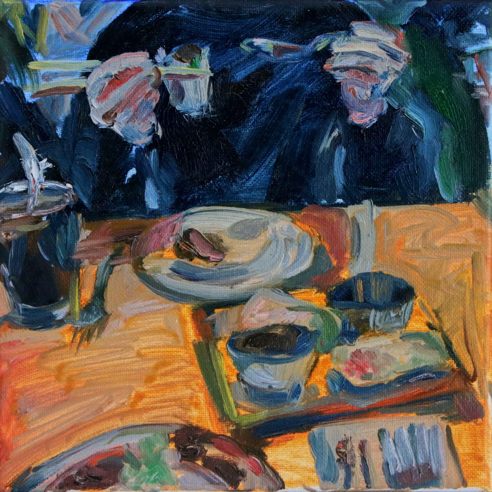
XII. V & T, Morningside Heights, NY
If you are from New Jersey, you’ll know what I mean when I say “Jersey-Italian.” Humongofied portions of traditional Italian dishes, with an added twist of store-bought cheese and marinara lacking depth, and a garnish of, well, no garnish. Thus, rendering the dishes no longer traditional. In this scene, Emma reaches for some of their thick cut fries. This is a great example of a moment where I was able to establish depth with ease because of the limited canvas space, using a muddled ultramarine blue to fill the small gaps and shadows between tables and beneath dishes.
Visit this spot if you’re looking for an easy dinner with a big group or if you are nostalgic about the Italian food back home (Jersey), I guess. The fries are great! As is the Heinz ketchup they give you.