PRINT
WRITINGS
Aquel Amplex
Analogue #1: Nostalgia
The Fascists Have the Outfits
Chorus: On Intention
The Things They Bought #1
Curator Spotlight: Victoria Campa
OPERFORMANCEF Interview
On Art and Aliens
Caroline Strickland at Union Pool
Remembering Who We Are
Painting in Defense of Life
Ask Casey: A New Advice Column
Archive
COMMUNITY BOARDS
Music
Literature
ABOUT
@READCOPY.CO
WRITINGS
Aquel Amplex
Analogue #1: Nostalgia
The Fascists Have the Outfits
Chorus: On Intention
The Things They Bought #1
Curator Spotlight: Victoria Campa
OPERFORMANCEF Interview
On Art and Aliens
Caroline Strickland at Union Pool
Remembering Who We Are
Painting in Defense of Life
Ask Casey: A New Advice Column
Archive
COMMUNITY BOARDS
Music
Film
Visual Art
LiteratureABOUT
SUBMIT
DONATE
@READCOPY.CO

Studio Diares
Even if you’re not making anything in the studio, you’re still being productive.
By Tasneem sarkez
03.01.2023
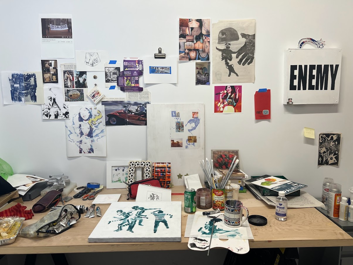
The past month in my studio has been about productivity without judgment. With more free time over the holidays, I’ve been able to go to the studio every other day and go in with no expectations of an outcome, just to be present. During the year, I’m in a constant rotation between school, work, and the studio, so it can be hard to find time to just “be” in the studio without the pressure of a deadline. Some days I wouldn’t make anything, just read or research particular imagery and text online. Even if you’re not making anything in the studio, you’re still being productive by putting work into your praxis and consuming materials of your interest.
I took the holiday break as an opportunity to delve into ideas I’ve been researching. This is what I’ve been into recently:
TEXT:
- Kitschy Arabic text tattoos: badly done, corny phrases, elaborate or decorative font styles. Especially people that get the wrong translations tattooed on them.
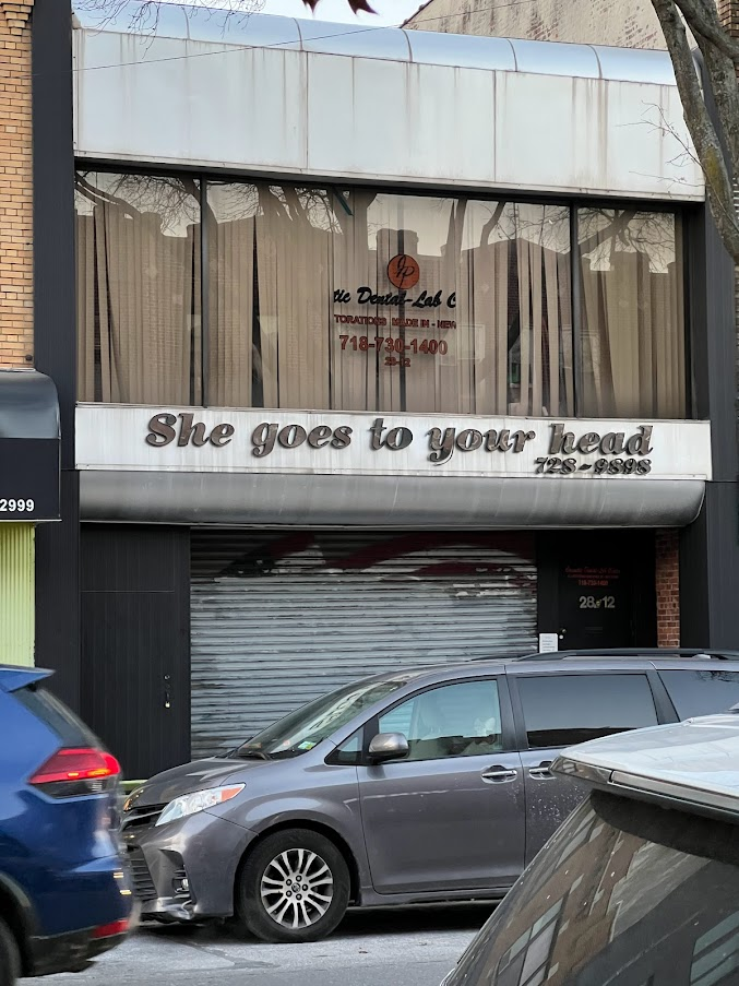
- Storefront names: I saw a place in Astoria called “She Goes To Your Head.” I like the weathered look some shops have to their text and the parallel some signs have to the everyday.
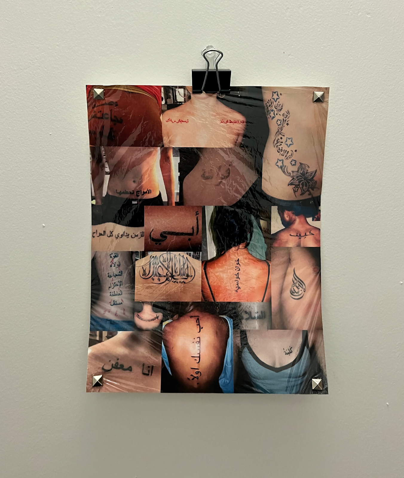
LEFT: A collage I made of “bad tattoos” layered with plastic wrap and metal studs, 8x10” (2022)
RIGHT: Storefront in Astoria
RIGHT: Storefront in Astoria
Any sort of text with a suggestion of irony in its language or context has been fun to play with incorporating into art. This is especially true for paintings or drawings where the text stands alone, either at a large or small scale. Months ago, I saw a banner on the ground in the Impact font that read, “Ex Sensation.” I plan to do a larger painting with the words mirrored vertically, so that the phrase reflects onto the viewer, mirroring ourselves—almost like the headline is being branded to who we are. My fixations on headlines and the semiotics of political language stem from the relationship I had with news at a young age during the Arab Spring. Headlines like these also relate to my interest in pop-culture iconography, especially within the early 1990s through the 2010s of the Arab world and how that relates to its contemporary gender structures.
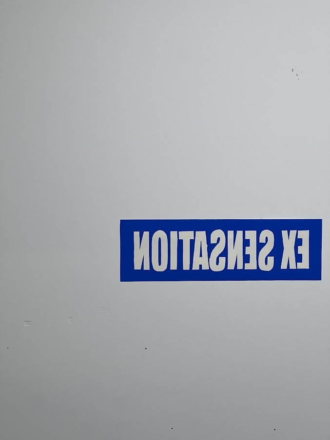
I cut out the phrase from a blue vinyl to play with the composition of the text. I warped the Impact font a bit vertically to give it more height. I’m trying to get an idea of what it could look like as a larger painting.
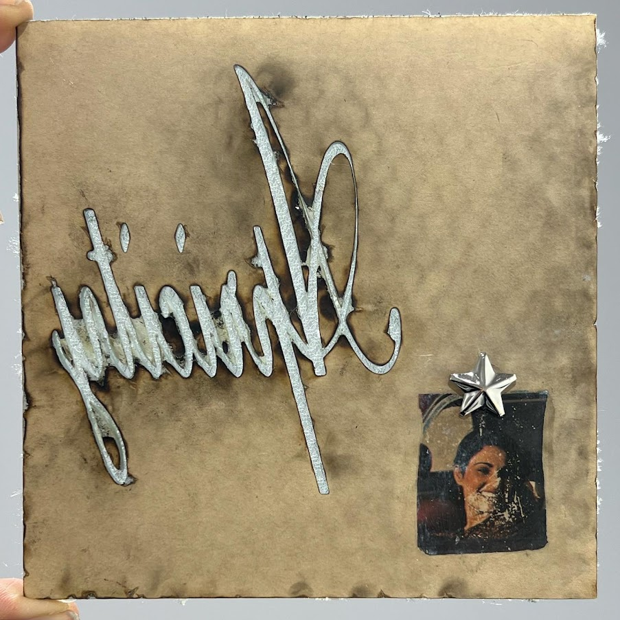
After playing with the “Ex Sensation” and mirroring, I did the same with one of my favorite words: “Apricity.” It means to seek the warmth of sunlight in the cold. I laser-cut the word from a piece of acrylic and flipped it over to the back because I liked the burned details. I added a photo transfer and metal stud in the corner. This is one of the smaller works I make just so I can do something with my hands.
I’ve also been liking cursive texts, anything that has a dainty quality that I can manipulate. I compressed this cursive so that the letters were tight together. I like that kind of contradiction.
KITSCH:
Dec 25, 2022
I spent the day in Astoria, Queens. I’d only been once, but I wanted to go to a restaurant called Little Morocco and walk along Steinway Street. Steinway Street is one of the popular neighborhoods for Arab Americans in New York, so I wanted to see the area for myself and take photos to work from, perhaps finding something to make a sculpture from, etc. I’m always working from the concept of Arab kitsch, so I saw lots of posters and objects that rendered text and images in that visual language.
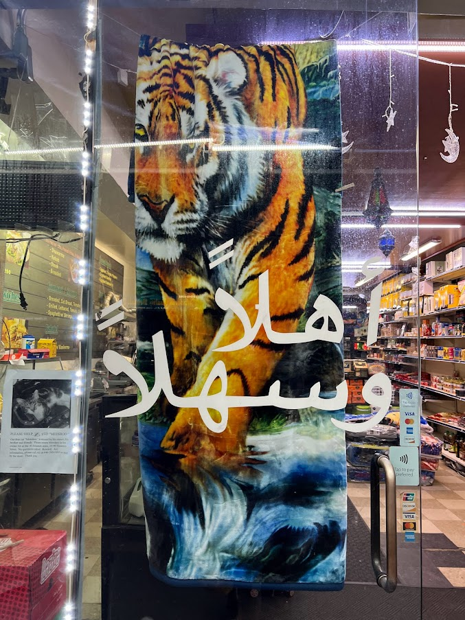
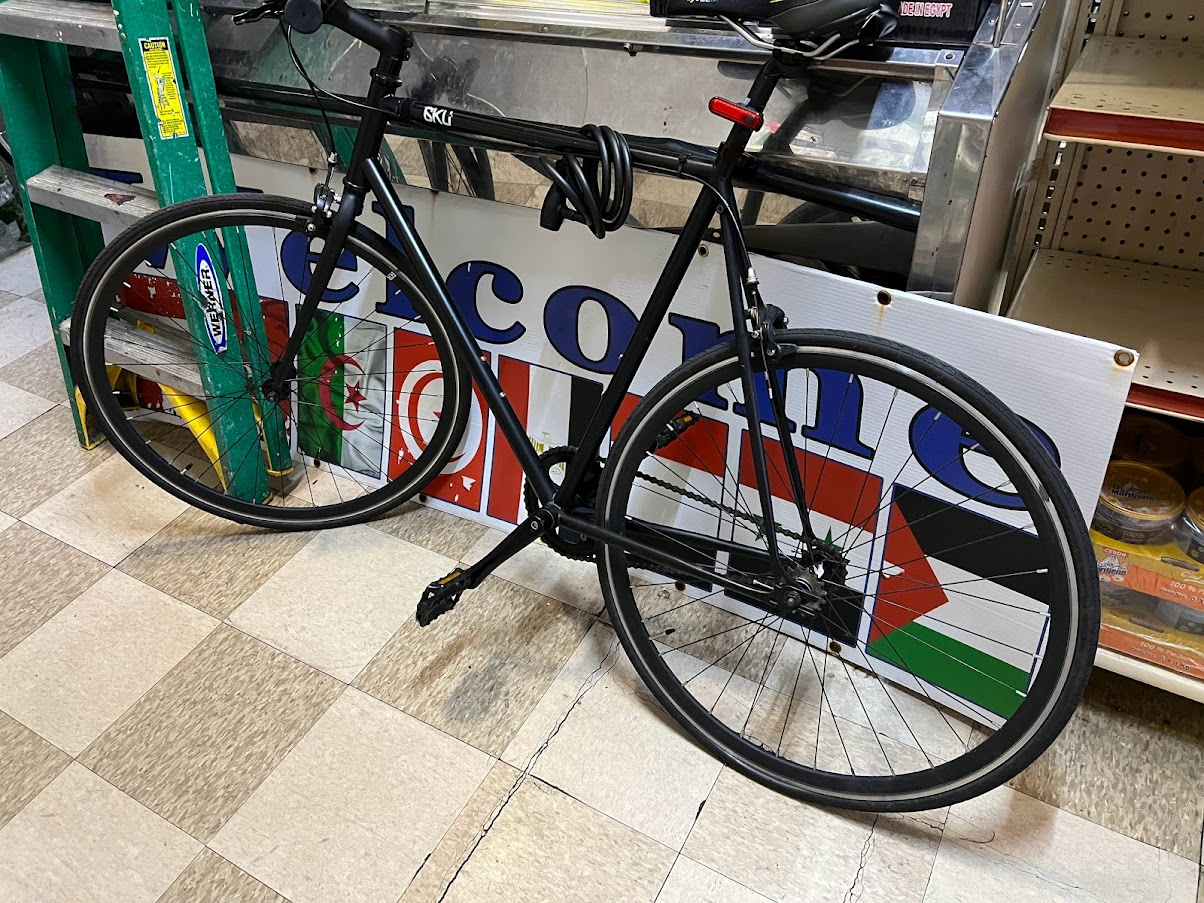
- Most immigrant households have at least one variation of this kind of blanket. They’re super heavy, fluffy, often floral, or with an animal. Very pixelated, low-brow-esque art. I liked this text, which says “Welcome,” layered on top of the glass.
- I like the symbols of bikes and cars, anything that implies motorized movement. That paired with the tattered “Welcome” sign of Arab flags was interesting to see layered.
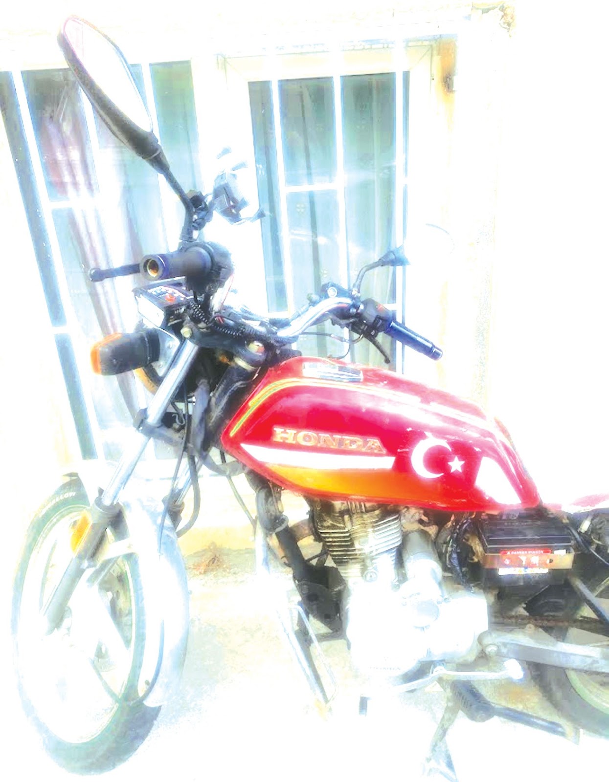
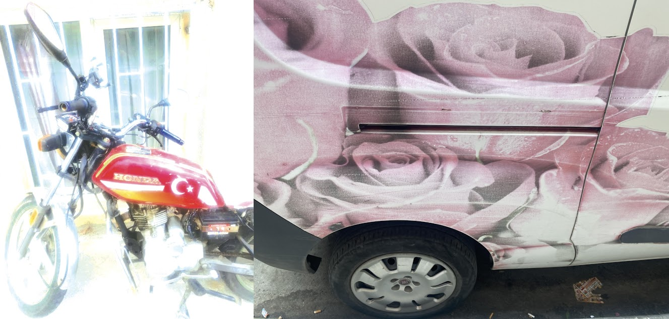
- I plan to paint the below images. I took both in Turkey this past summer. I like imposed images that fade because of the implied passage of time with their weathering, especially when those images are on unconventional things—like roses on a truck.
January 2, 2023
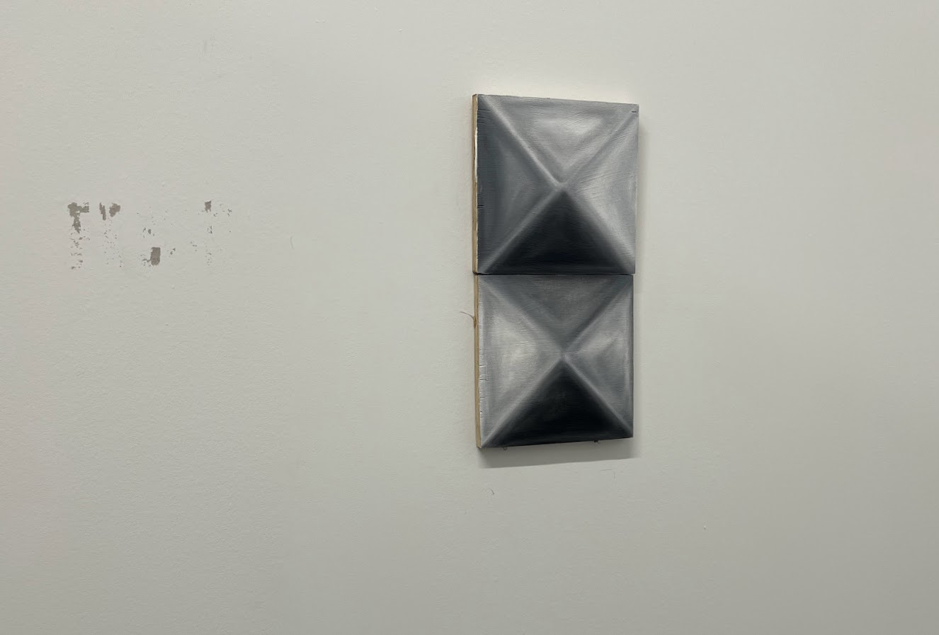
When I got into the studio, I knew I wanted to challenge myself to do a still life of an object. I looked around and gravitated towards a pile of studs. I had a 5x5-inch square block, so I painted the stud to scale. I often paint oil on wood, but hadn’t to a scale as small as this or painted an object.
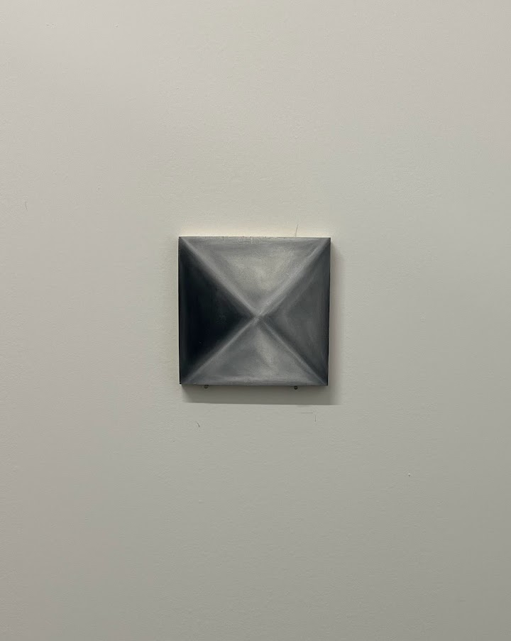
I want to continue to make more of the studs so that the configuration of them has this element of play to create any shape or spread itself out to as many there are to toy with. The goal now is to continue cutting wood and painting to have a group of at least ten in the next month. My interest with the sartorial function of studs bleeds into militant imagery and their industrial aesthetic. They give an implication of strength to anything they are affixed to.
January 5-12, 2023
I haven’t been home (Portland, OR) in a year, and every time I visit, there are always photos, objects, or parts of my home that reveal something new to me. I took advantage of being home to delve into archives, scanning images and taking photos of certain decorations, to revisit as source material when I was back in the studio.
ARCHIVE:
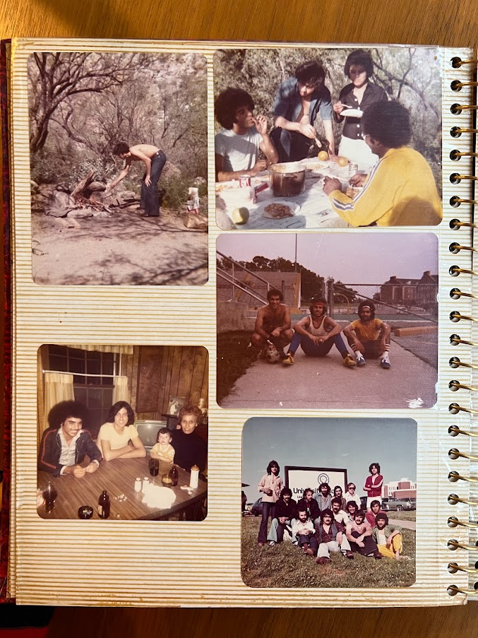
- My dad’s photos from the late 70s and 80s document the beginning of his coming to America. The style, soccer photos, scenery, etc. all have good color palettes and compositions.
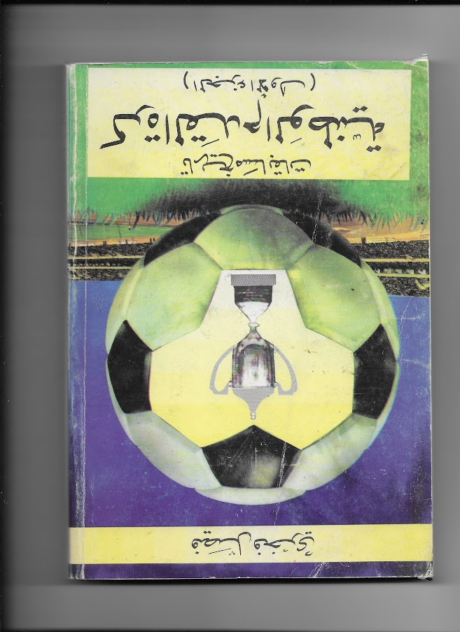
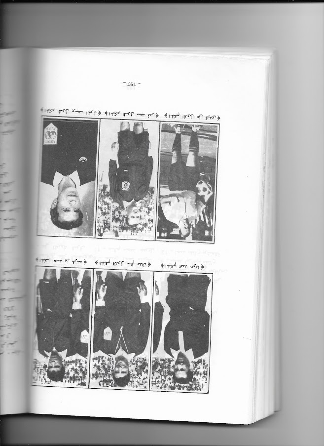
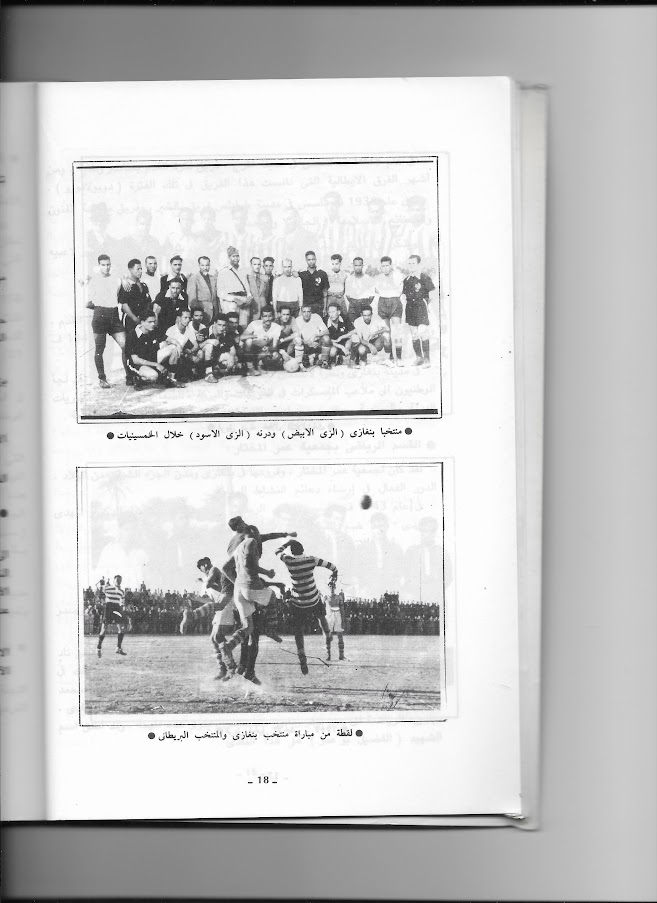
- My mom’s friend wrote a book about the history of soccer in Libya, so I scanned a couple pages of images that I liked.
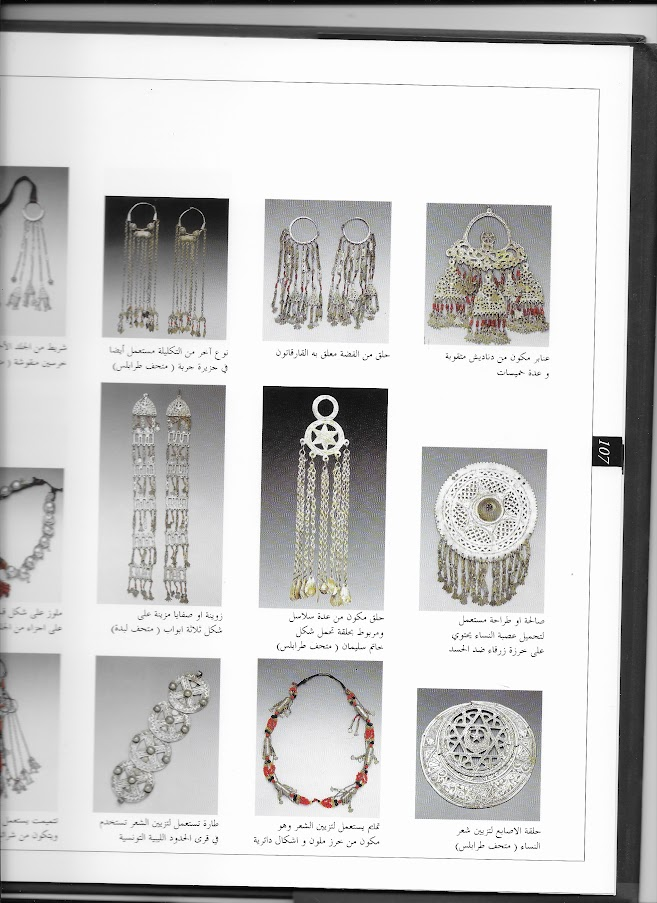
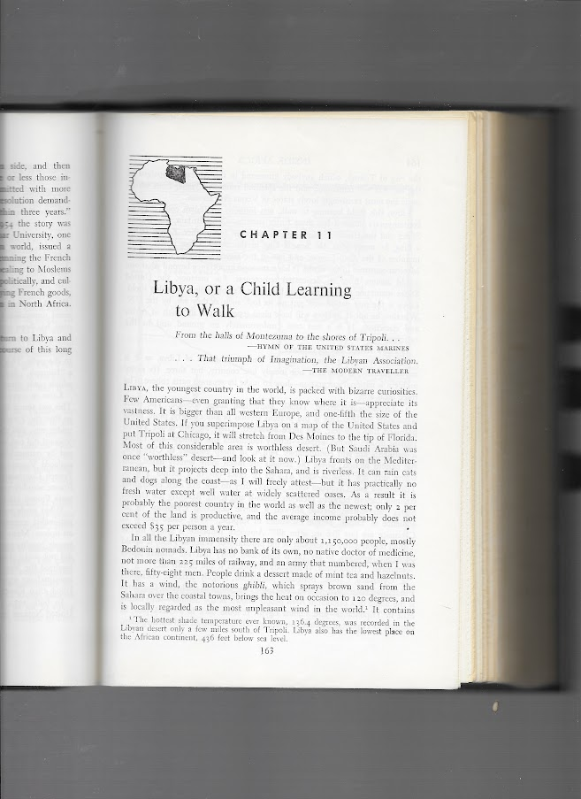
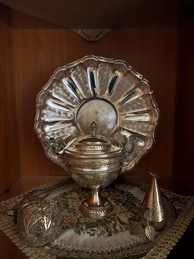
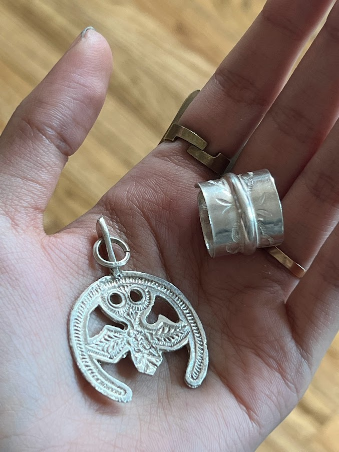
- The decorations in my parent’s house are mostly silver decor. We have a book about Libyan silver jewelry, so I scanned pages where I liked the silhouettes and smaller detailing.
SOCCER:
January 15, 2023
My fixation on the language and imagery of soccer—as it pertains to being Arab and first-generation—followed a painting I made that paralleled Mo Salah and my dad to idealized values of Arab success that are embedded into the cultural significance of soccer. The language of scoring, winning, defense—the lexicon of soccer doubled the trials and tribulations of my dad navigating citizenry. I grew up playing soccer. The more I think about soccer, the more I realize its presence in my life and the history that precedes me. I made a jersey and framed it to resemble the style of those presented in halls of fame. I started reading about and watching more of the sport, trying to find the right moments to reimagine.
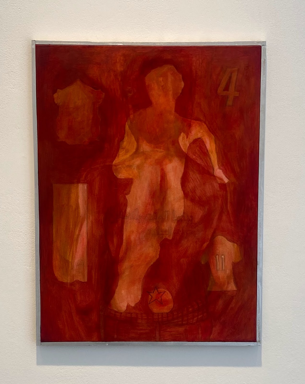
Painting mentioned above
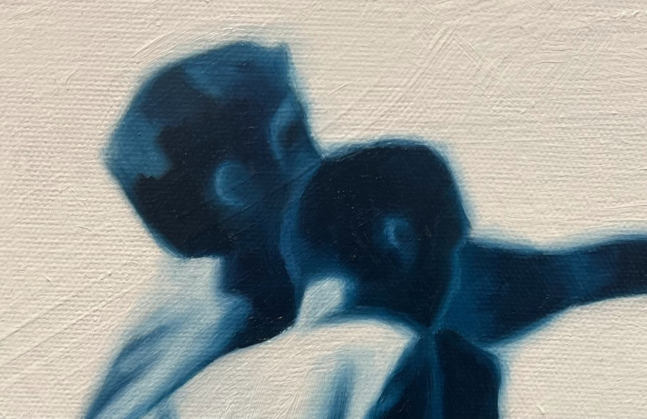
In the soccer book I scanned, I really liked this image of Benghazi vs. Britain.
- I did a small sketch of the image. I really liked how the players all overlap, and how the stripes came into play with it. There was a lot of tension and movement at the same time.
- I knew I could translate this into a monochrome painting, so in the sketch, I mapped out the values and composition.

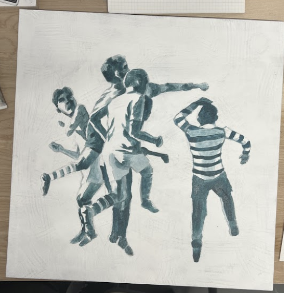
- I sketched it out, laid down an underpainting, and then went to paint for about seven hours till I finished. It’s oil paint on a 15x15-inch canvas. I knew I’d be able to get the painting done in a day if I spent the whole day doing it, working at a scale that small. With all the blending I wanted to do, I didn’t want to stop.
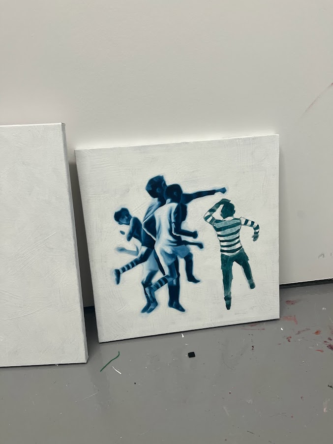
- I knew I wanted the colors to be blue. I really like sun-faded advertisements, especially because ones that have been left outside for years tend to fade to blue. I wanted the blue to gesture towards that kind of nostalgia.
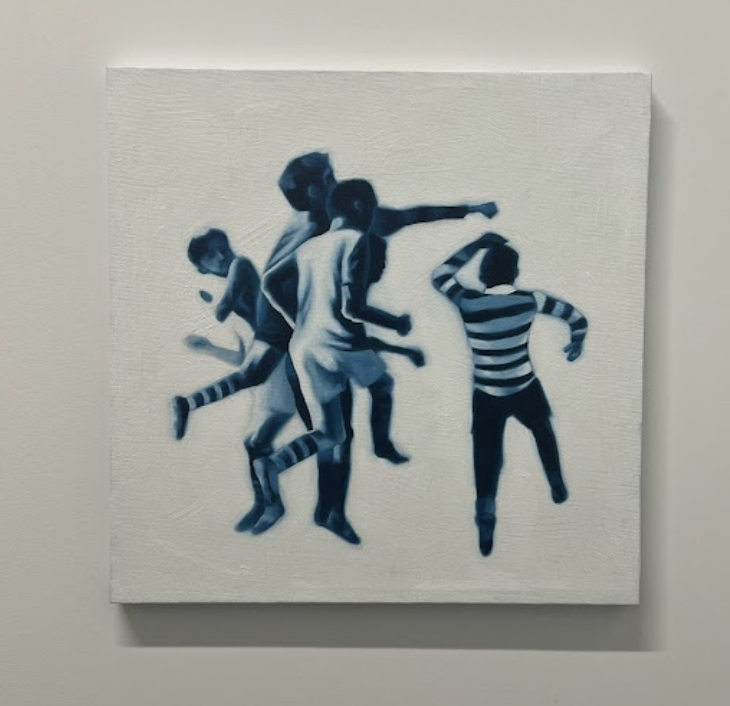
This is my favorite part. Sometimes when I'm painting, I get really lost into a specific part of the form, and I’ll re-work the same layers for a long time. I had that feeling with this part, where the two players meet. It has a loving quality to it—I think because of how close the players are and where they are caught in embrace, despite being in a context where they’re against each other.