PRINT
WRITINGS
The Things They Bought #1
Curator Spotlight: Victoria Campa
OPERFORMANCEF Interview
On Art and Aliens
Caroline Strickland at Union Pool
Remembering Who We Are
Painting in Defense of Life
Ask Casey: A New Advice Column
Archive
COMMUNITY BOARDS
Music
Literature
ABOUT
@READCOPY.CO
WRITINGS
The Things They Bought #1
Curator Spotlight: Victoria Campa
OPERFORMANCEF Interview
On Art and Aliens
Caroline Strickland at Union Pool
Remembering Who We Are
Painting in Defense of Life
Ask Casey: A New Advice Column
Archive
COMMUNITY BOARDS
Music
Film
Visual Art
LiteratureABOUT
SUBMIT
DONATE
@READCOPY.CO

Studio Diary 1: Julie
AUGUST:
THINGS I’VE THOUGHT,
THINGS I’VE LISTENED TO,
THINGS I’VE MADE,
THINGS I’VE SEEN
By JULIE SOHJIN KIM
7.11.2021
SUBJECT MATTER ON MY MIND RIGHT NOW
Scenes of parties, large gatherings; rooms overflowing with strangers, where you can hear overlapping voices, feel the bass, and smell the odor of bodies and alcohol circulating through the canvas; colored lights against darkness; people burrowed in shadow and people illuminated by wacky colors; and stillness and time slowed down, but in staccato.
The social deprivation that is the aftermath of the pandemic and the thrill of city nightlife coming back into full swing both assume a hefty role in my attraction towards these types of nighttime scenes. Emptiness, the built up eagerness, the itch to go outside and mesh with new people all simmer into visualizations of crowded rooms, conversations, and socialization.
I’ve even made a Spotify playlist to accompany my studio time with these paintings and to keep me submerged in the mood I am trying to capture in the scenes. It’s named after the first painting of this theme that I finished this year, Tell Me Where to Look. Music is so involved in my art. It’s a synergetic process––the songs I play keep my brush moving and simultaneously, the worlds I build within my work inspire my Spotify playlists.
A good lineup to summarize what I was going for this round: “Loud Places” by Jamie XX, “Attrape-rêve ” by Polo & Pan, “Augustine” by Blood Orange, and “I’m on Fire” by Chromatics.
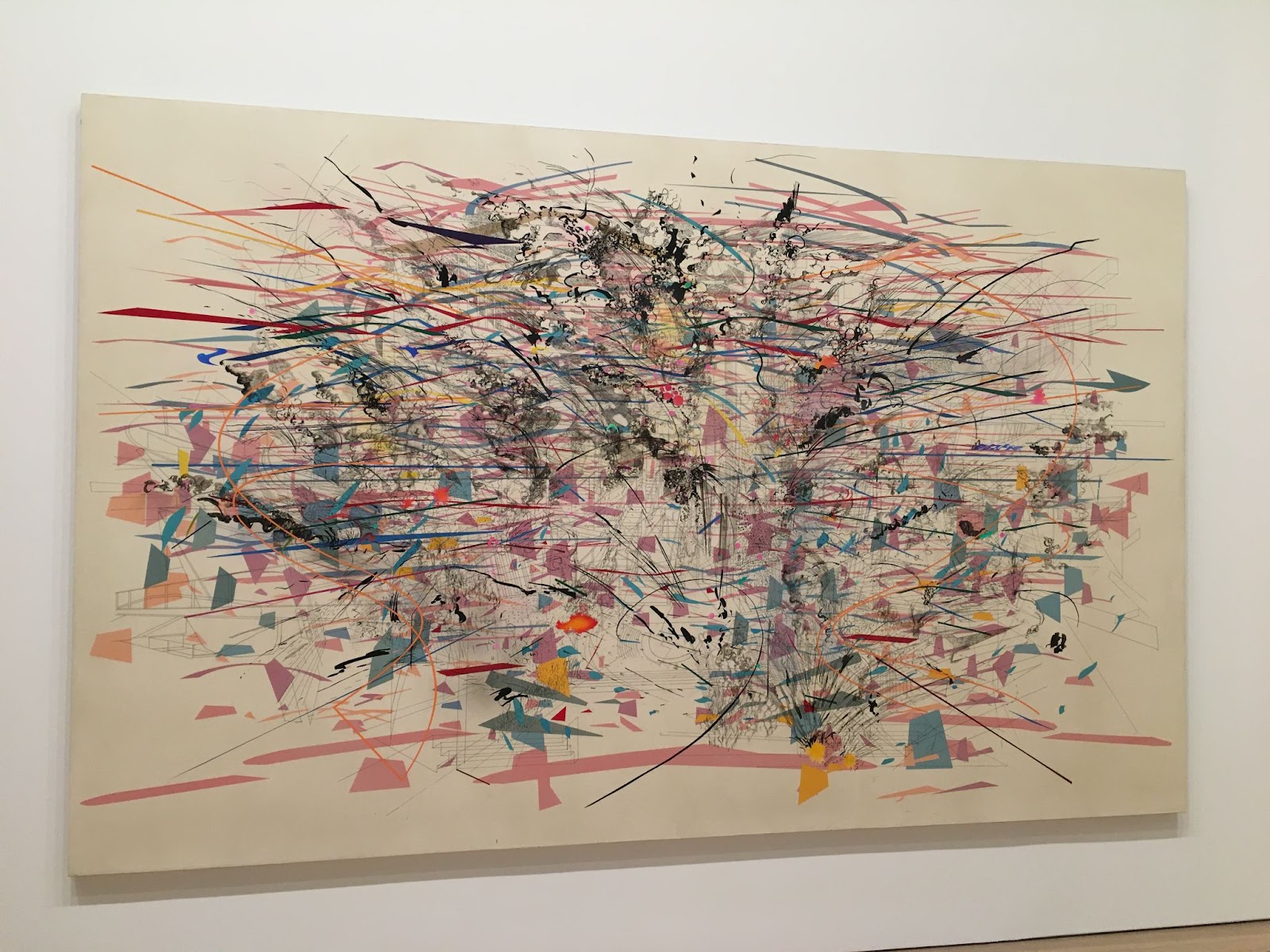
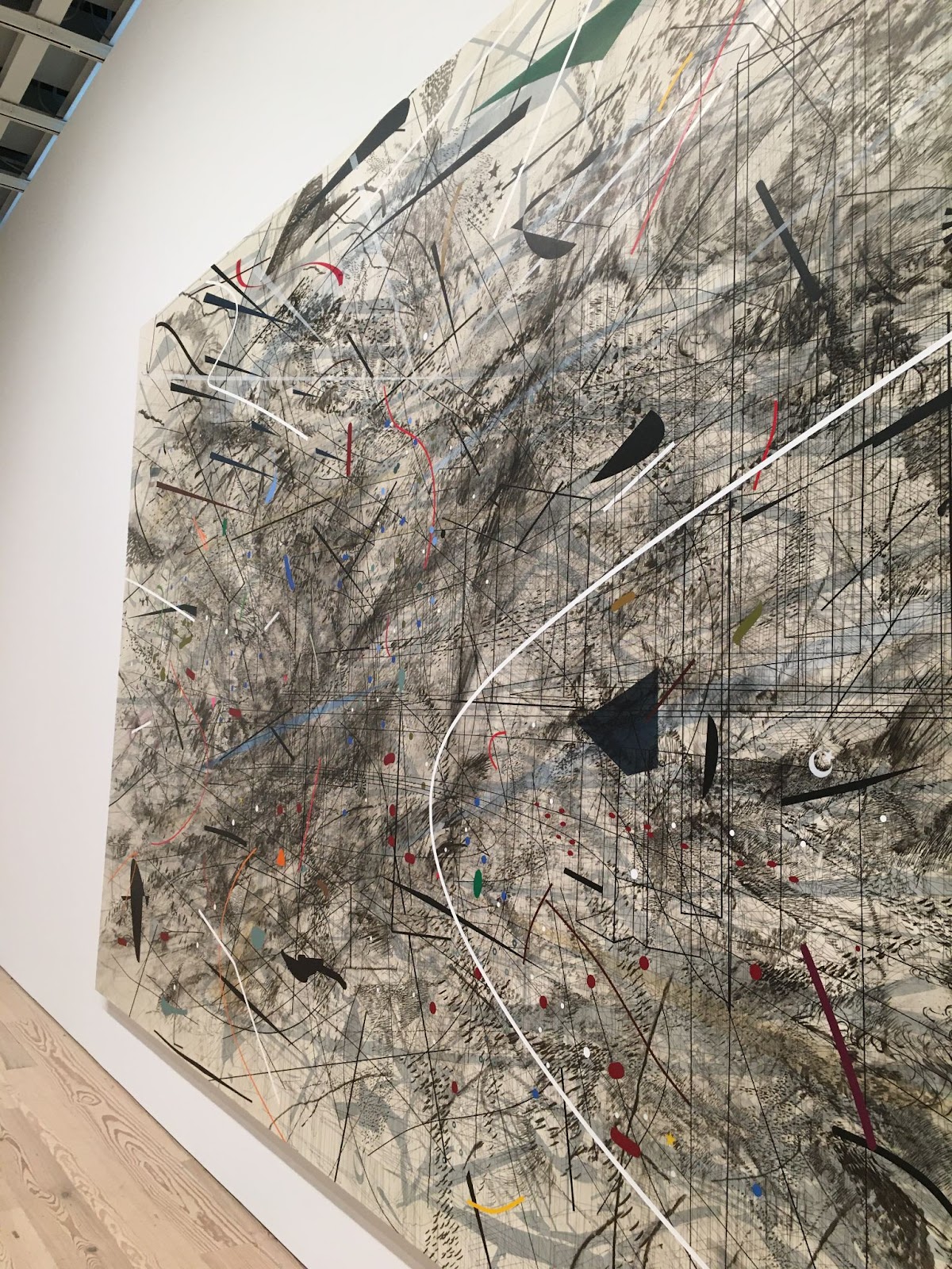
My viewing of Julie Mehretu’s current exhibition at the Whitney, back in March, is now also a constant source of inspiration. I want to fulfill that full bodied canvas-to-viewer conversation that Mehretu achieves with her wall-sized works. I will never forget the feeling of being so entranced, catching myself drifting into the ecosystems on her canvases, and wading through every shadow, current, and overpass brought to life by her methodical line work. Within my own paintings, I am trying to create livable, breathable environments so that viewers can share the same plane and the same air as my oil painted characters.
Work in Progress 1:
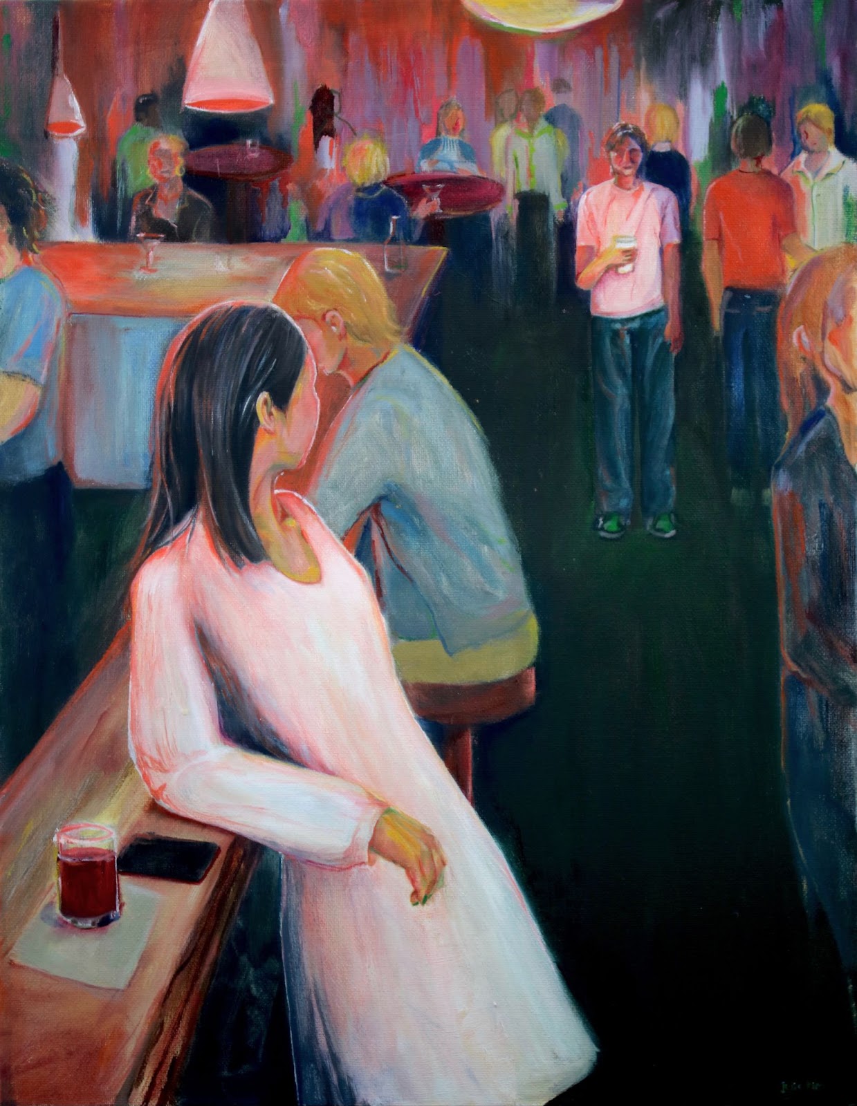
Second in line in my progression of pieces romanticizing New York City night life this year is this 3’ x 4’ oil painting that, at the moment, doesn’t feature a lot more than improvised turp-wash drips, thinly layered oranges, pinks, and ceruleans, and a central confrontation between two characters. I’ve derived inspiration from my beautiful friend Sela and her effortlessly striking short haircut to create a story of a young woman and her possible lover, ex-lover, or more-than-friend (?) who has her back turned to us, sporting an emerald green jacket (this green blazer was a crucial component of the painting that I brainstormed during the initial sketch stage).
The aesthetic choices I make, like the green jacket, are pretty random. They mainly set a visual foundation that helps me make thoughtful decisions for coloring the rest of the canvas. I was so fixated on the idea of a green jacket that I even went out and bought one for myself. I hope the bold green will anchor the rest of the cool tones dispersed throughout the painting, but also stand alone as a defining feature that dictates both the canvas and the narrative.
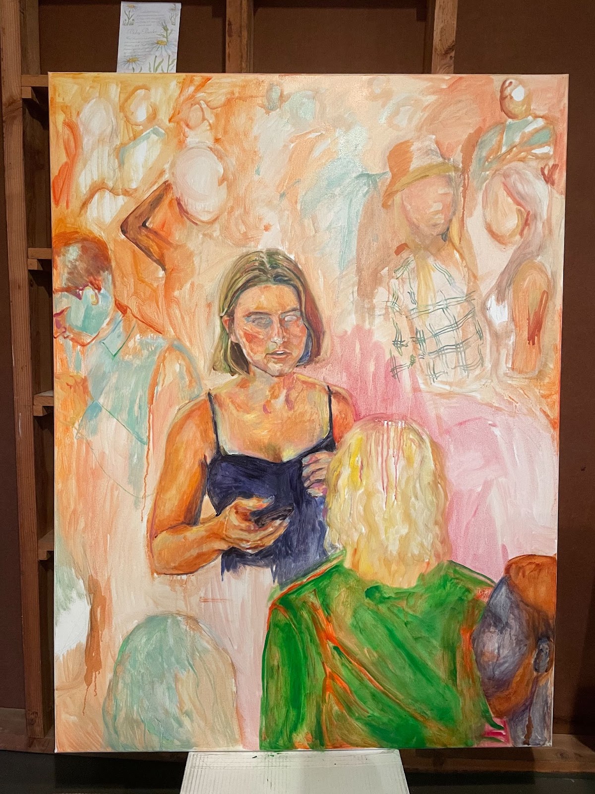
Questions I am asking myself (some of which I won’t necessarily answer through the painting, so that the viewer can interpret it themselves):
1. What is the premise of their relationship? Did they come to this function together? Is this a first-time encounter or a coincidental run-in after time apart?
2. Is it hurt, betrayal, or confusion, or just a passionate discussion that is brewing between them? What is at stake or on the line here?
3. Is this a one-sided story? The Sela-inspired character’s face will be what dictates the viewer’s assumption about their conversation, as the other character is turned away from us.
4. Do I leave the background as is (the translucent warm tones––which I had intended to be only a foundation to paint on top of, but am now loving) or do I build up areas of blacks and blues to indicate the assumed darkness of the room? Will leaving it light take away from the original nightlife edge that I had pictured? Or is the current surreal tone perhaps a better way to express the intoxicating haze of a weekend night?
5. How much do I render the background characters? Will this be a method of establishing perspective and distance?
So many decisions to still make, but I’m itching to finish it soon.
OTHER SUBJECT MATTERS:
Friends, and food. But more focus within the act of dining, as a human, sometimes intimate, and sometimes lonely experience.
Solitude, with or without the presence of bodies. A vacant room, a table of food, an empty couch, etc. A chance to establish atmosphere or human emotion without human forms taking jurisdiction.
Group portraits. To represent some common identity or quality among the subjects, or to story-tell relationships between grouped subjects.
After reading Olivia Laing’s deeply personal exploration of Edward Hopper’s life and works in The Lonely City, I decided to explore my own nostalgia and memories––particularly of loneliness in public spaces––in a Hopper-esque manner.
Some reference pieces: Nighthawks, Automat.
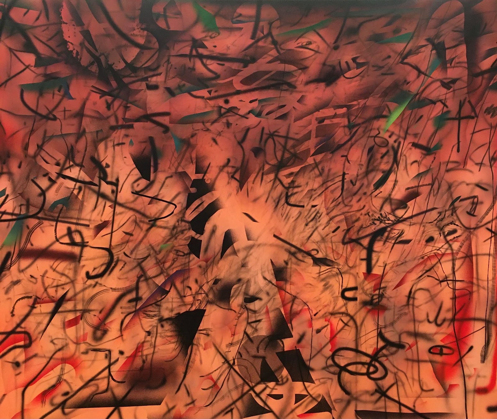
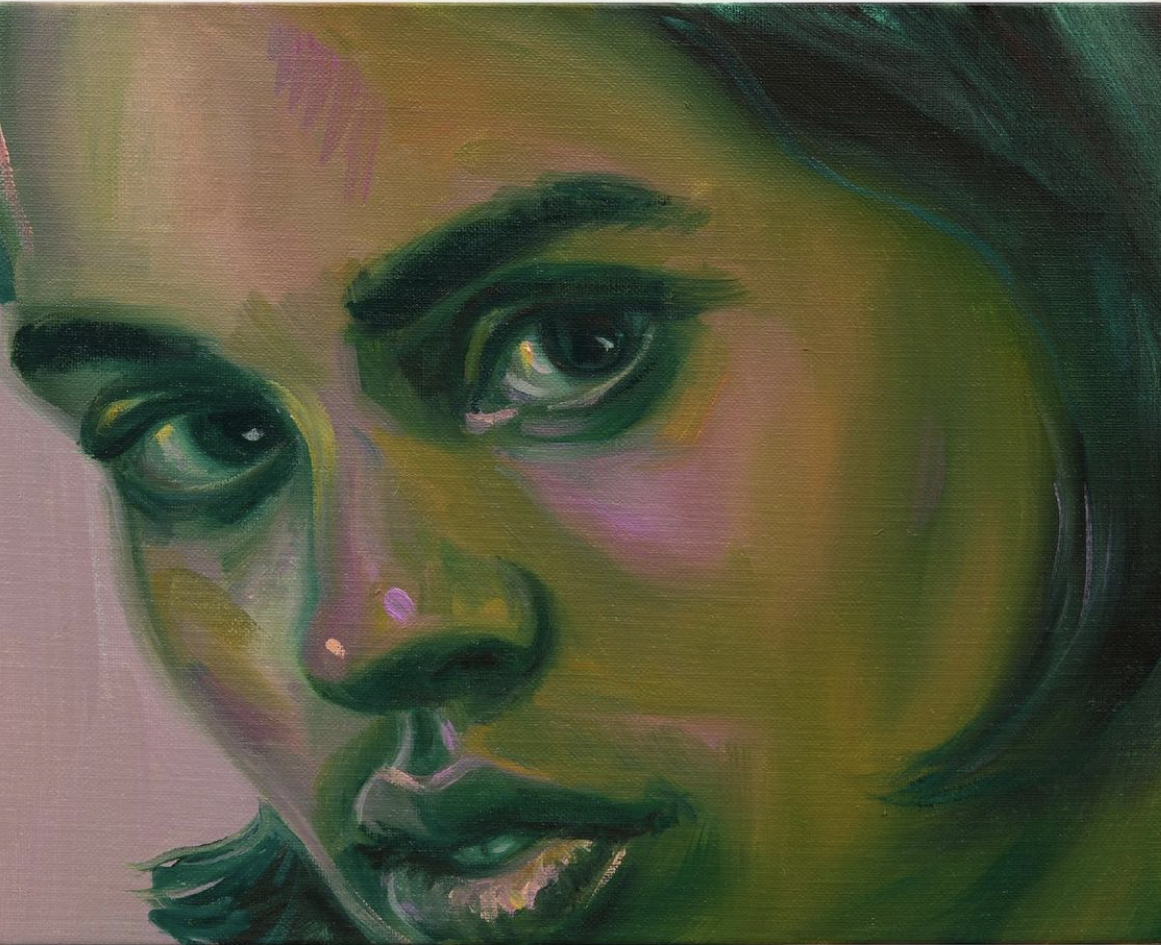
I also looked at how Chloe Wise incorporates green tones into skin, which is something I wanted to try. Also a shoutout to Salman Toor’s works, which I viewed on the same day I saw the Julie Mehretu exhibition, which incorporate lots of greens and intimate nighttime lighting.
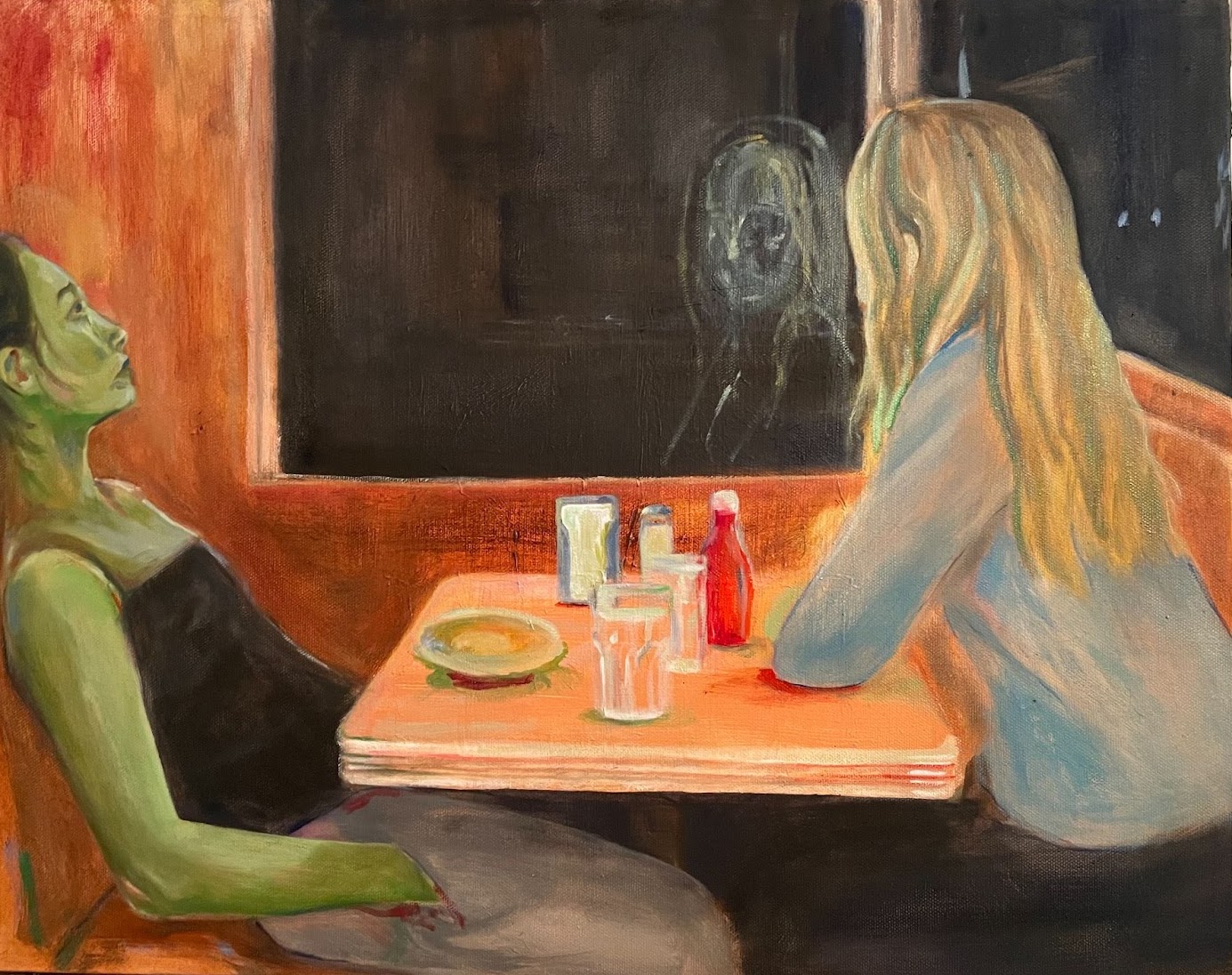
Work in Progress 2:
A scene of my friend Micaela and I sitting at a diner that is supposed to closely resemble Tom’s Restaurant, a fan favorite up by our Columbia campus. We are finished with our meals in the moment of the painting, leaving us in the 10-minute limbo of quiet that precedes getting up to leave the restaurant. Micaela stares out the window, while I sit slouched, despondently staring up at the ceiling. My choice to render a face through a reflection, rather than directly in the flesh of the character, is a foreign step for me. (Which makes me nervous!)
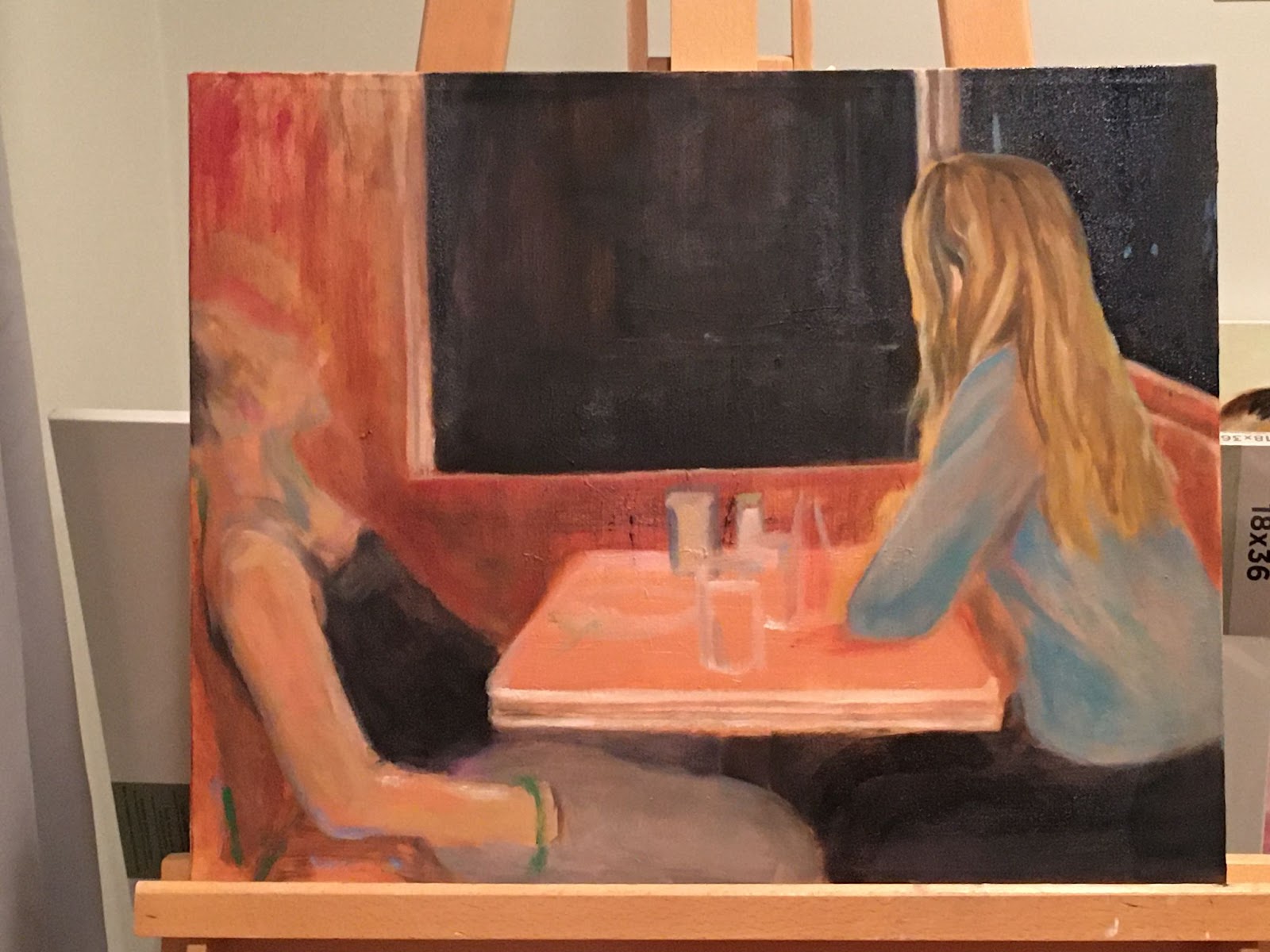
After foraging the internet for the perfect diner scene reference photo to establish some spatial accuracy, I finally settled on this screencap from Moonlight:
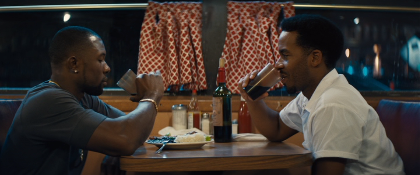
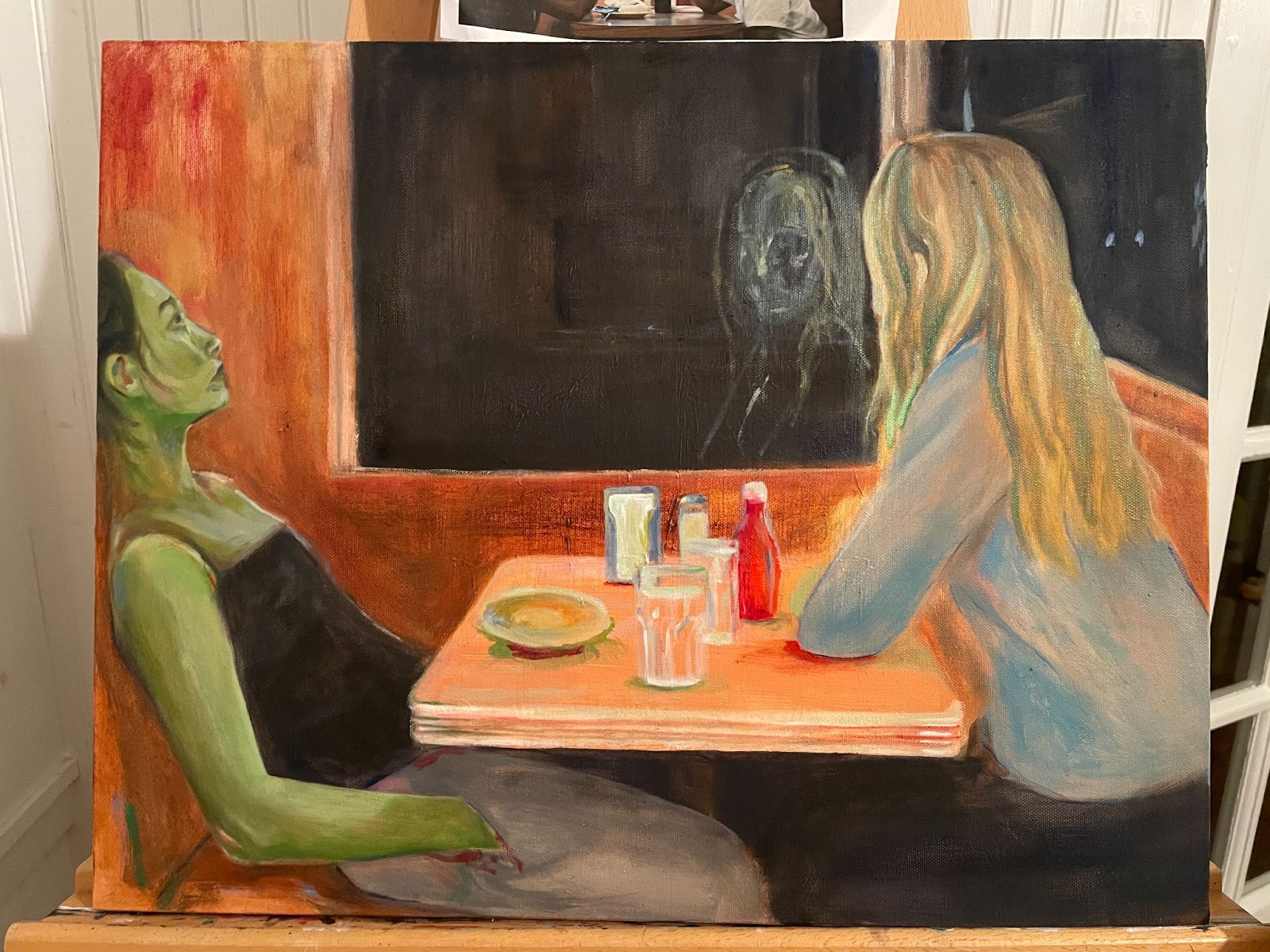
Most of the time when I paint, I’ll zero in on a particular mood or emotion that I am trying to evoke, and let that take the reins on how and what I paint. In this piece, I of course resonate with my own self as a subject, and am meditating on a numbness, melancholy, and boredom that creeps in during late hours. Maybe I’m pondering what I’ll eat for breakfast the next morning, or about a paper I need to finish, or just simply thinking about how sad it is that the day is over.
The same way that movies or music can put you through an experience you’ve never personally had, I like my paintings to become an alternate reality wherein I go through a completely imagined, but very much real-world emotion. Maybe devastating heartbreak, or vengeance, or even recreated nostalgia about something that I once felt but am not feeling anymore. I think of my work as a board of empathy for distinct emotions.
Work in Progress 3:
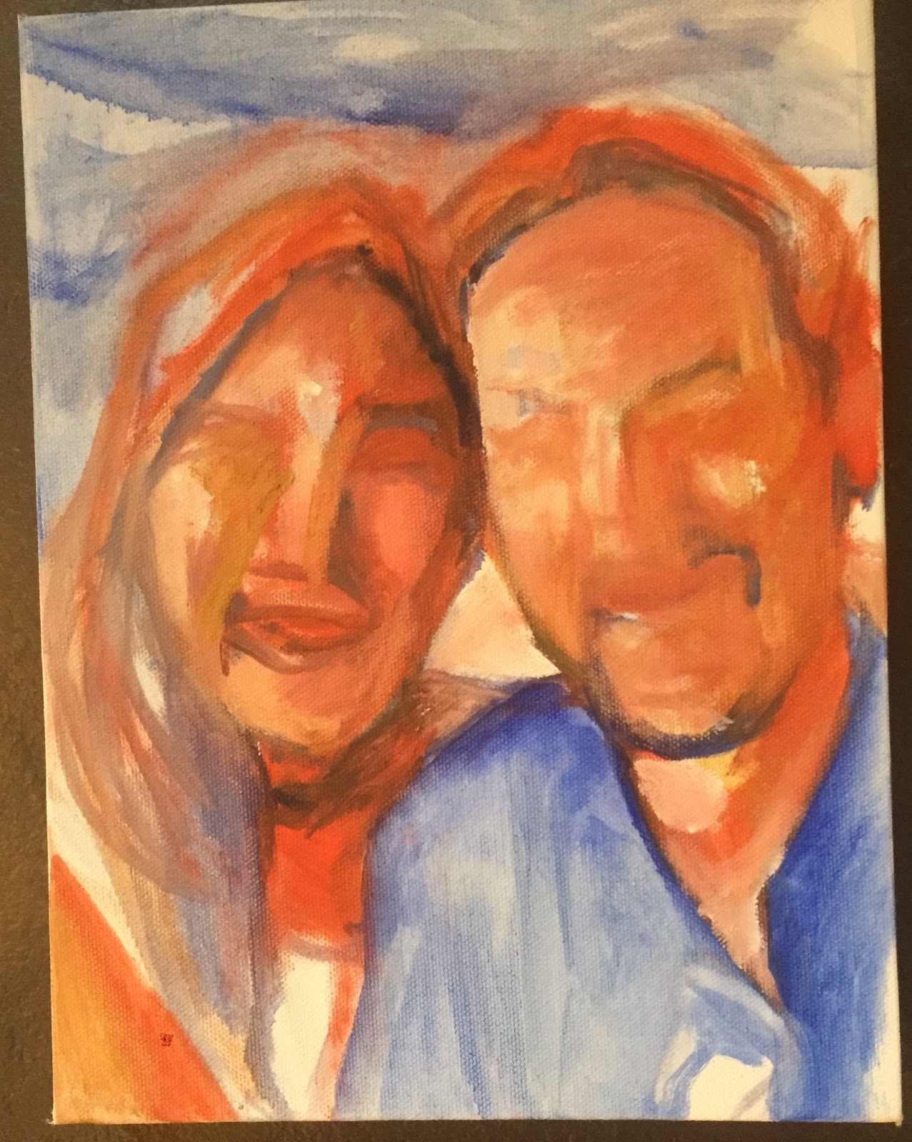
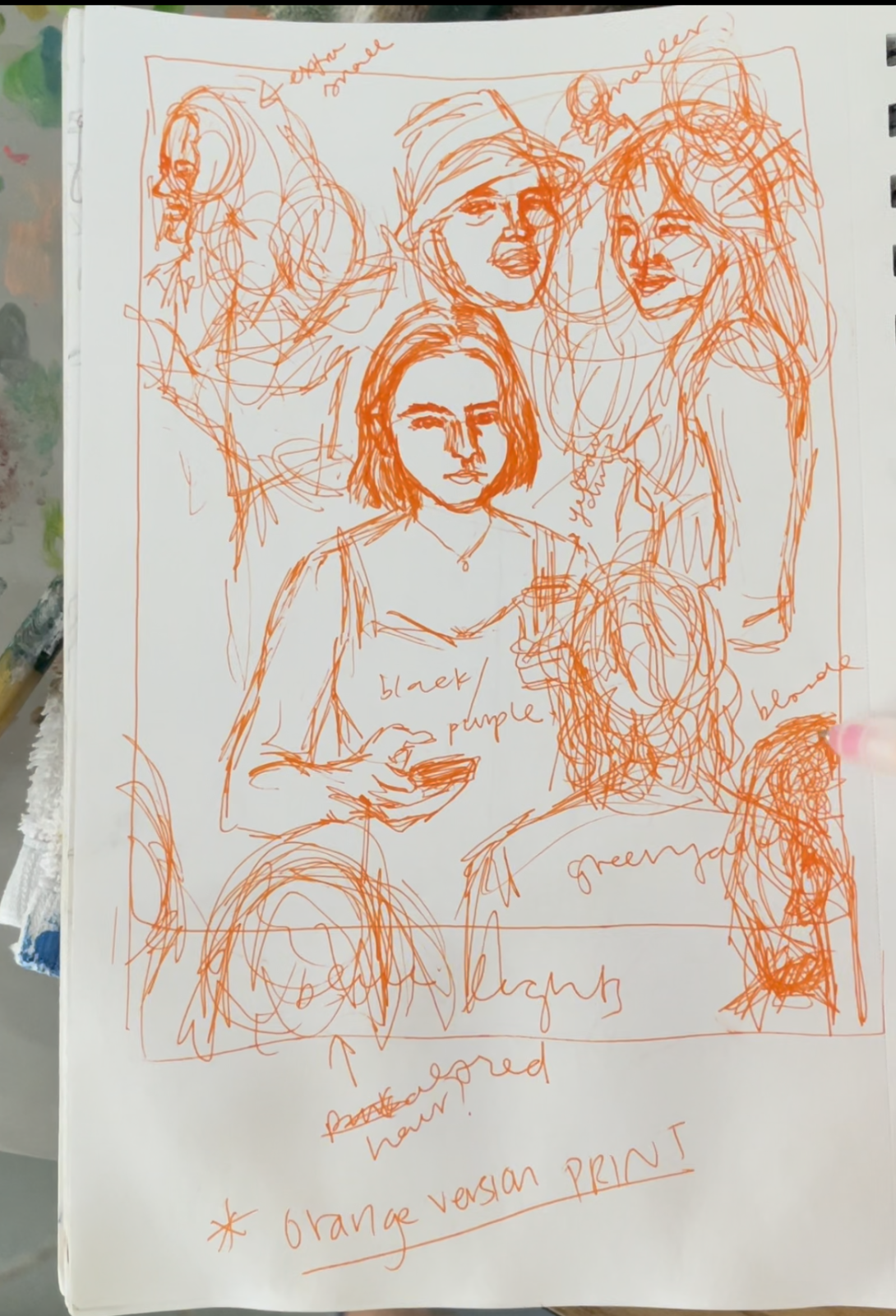
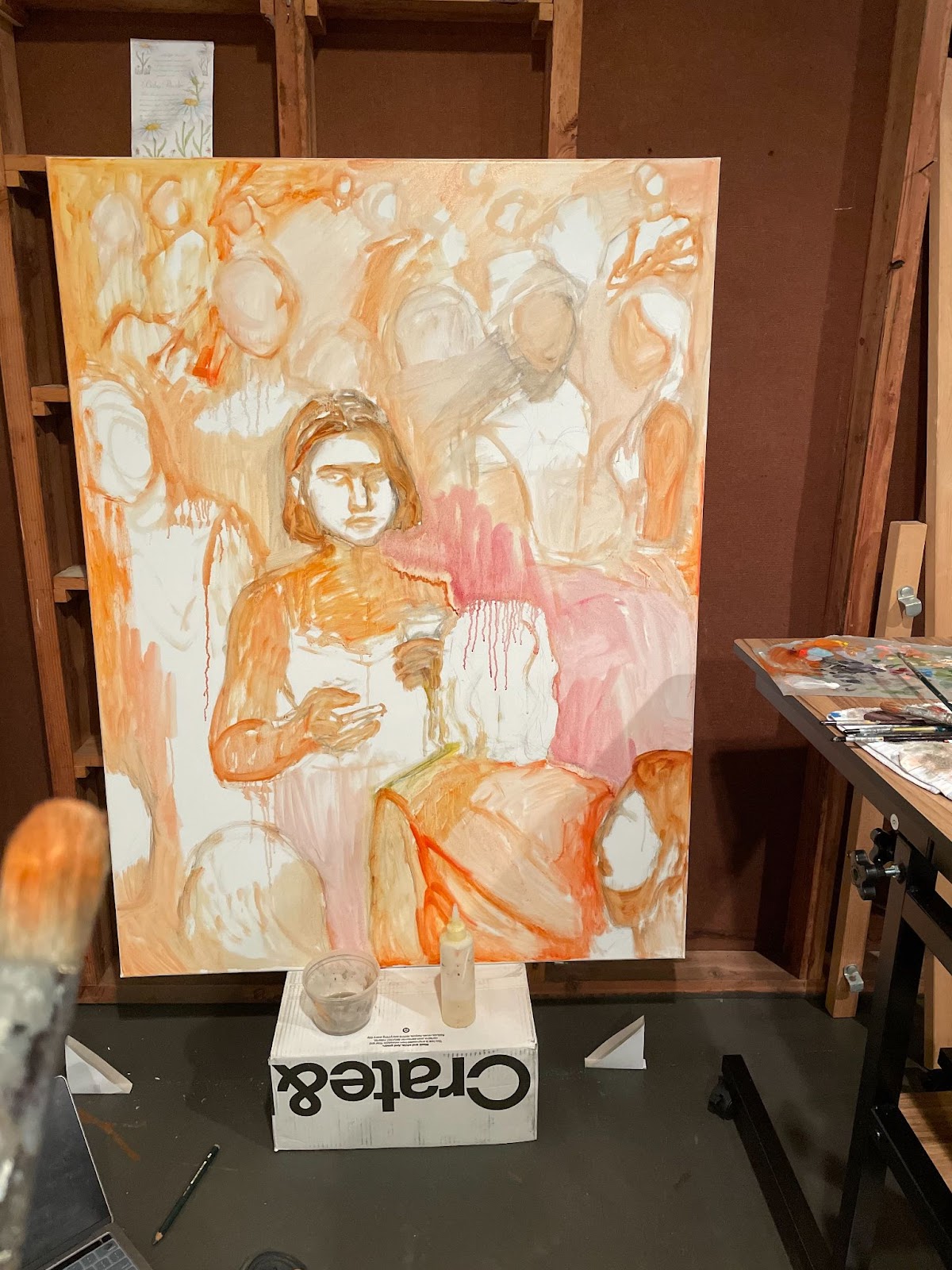
I just started this commissioned portrait for my mom’s friends, to celebrate their three year anniversary. The canvas is 9 x 12 so I had to crop out most of the beautiful background in the reference photo––a beach in Cancun–– in order to focus on their faces. I’m thinking of going with my usual color palette of blue and orange, but I definitely want to add a unique color element, which will be an improvised surprise. Lately, I’ve loosened up on my brush strokes when rendering people. I’ve realized it’s a much easier and more freeing process for me. But I also appreciate the beauty of the more calculated realism that I have produced in the past. This one is up in the air. What I don’t want to lose sight of, however, and what will be the driving force of the piece, is emulating the feeling of love.
[commission image]